NEON CITY FESTIVAL
FESTIVAL MAP
FESTIVAL MAP
︎ILLUSTRATION
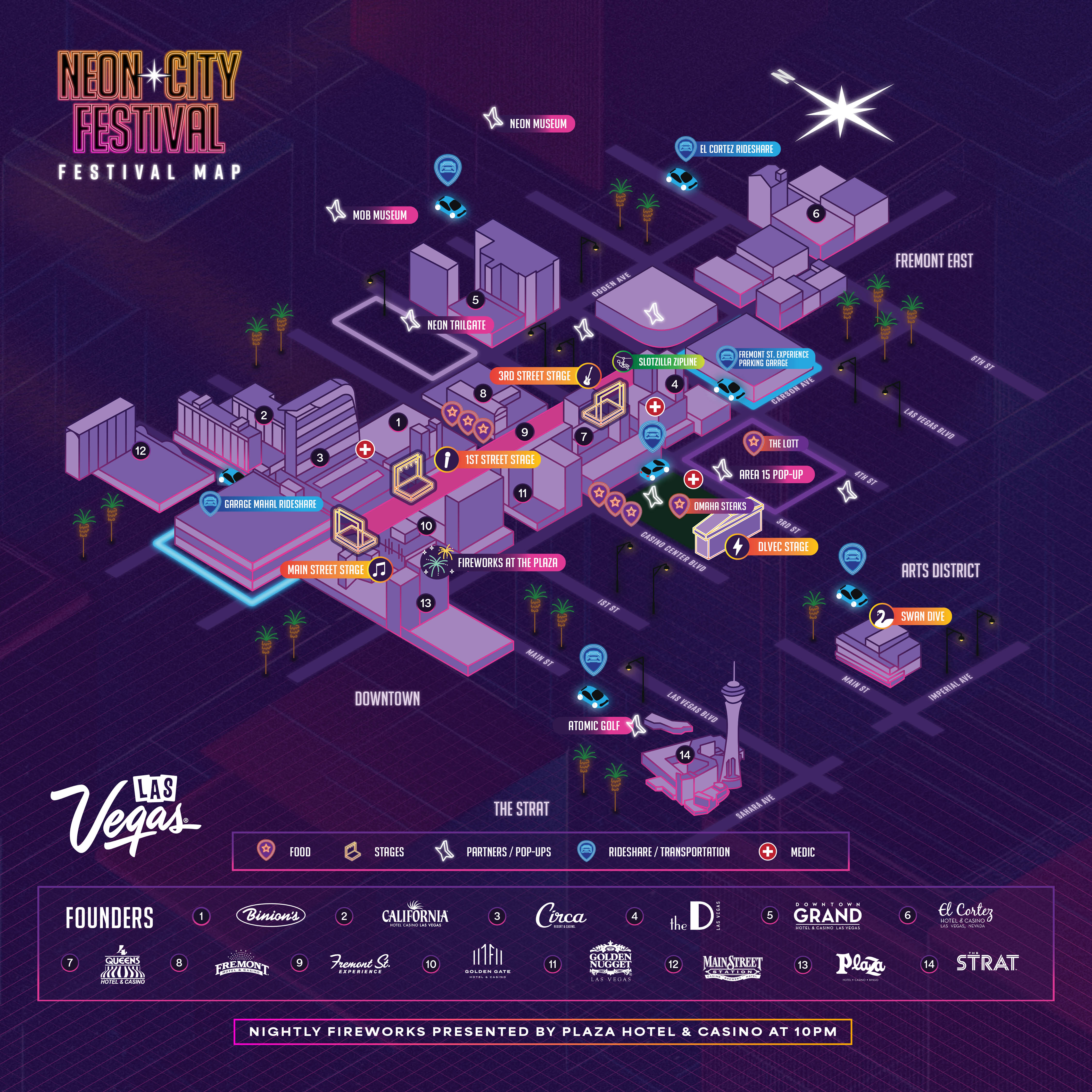
An isometric map design for Neon City Festival in Downtown Las Vegas, Nov 22-24.

CALL TO MIND
︎ILLUSTRATION
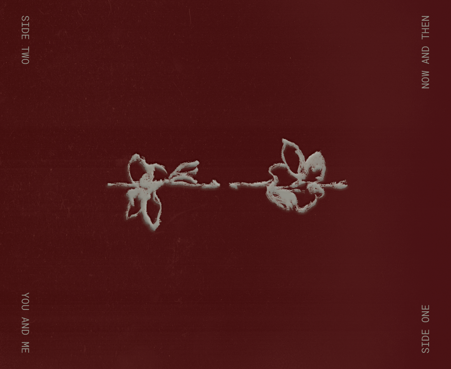
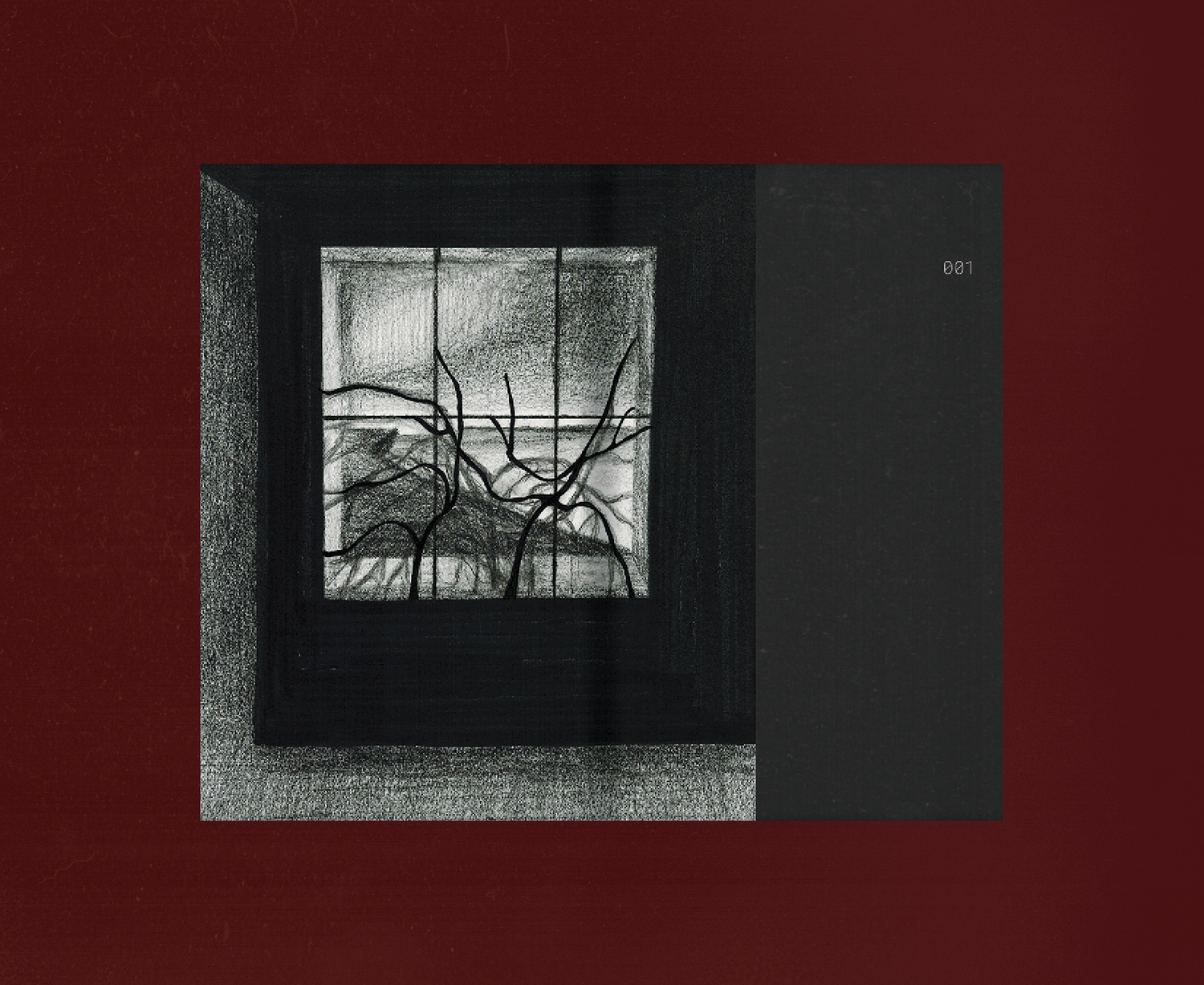
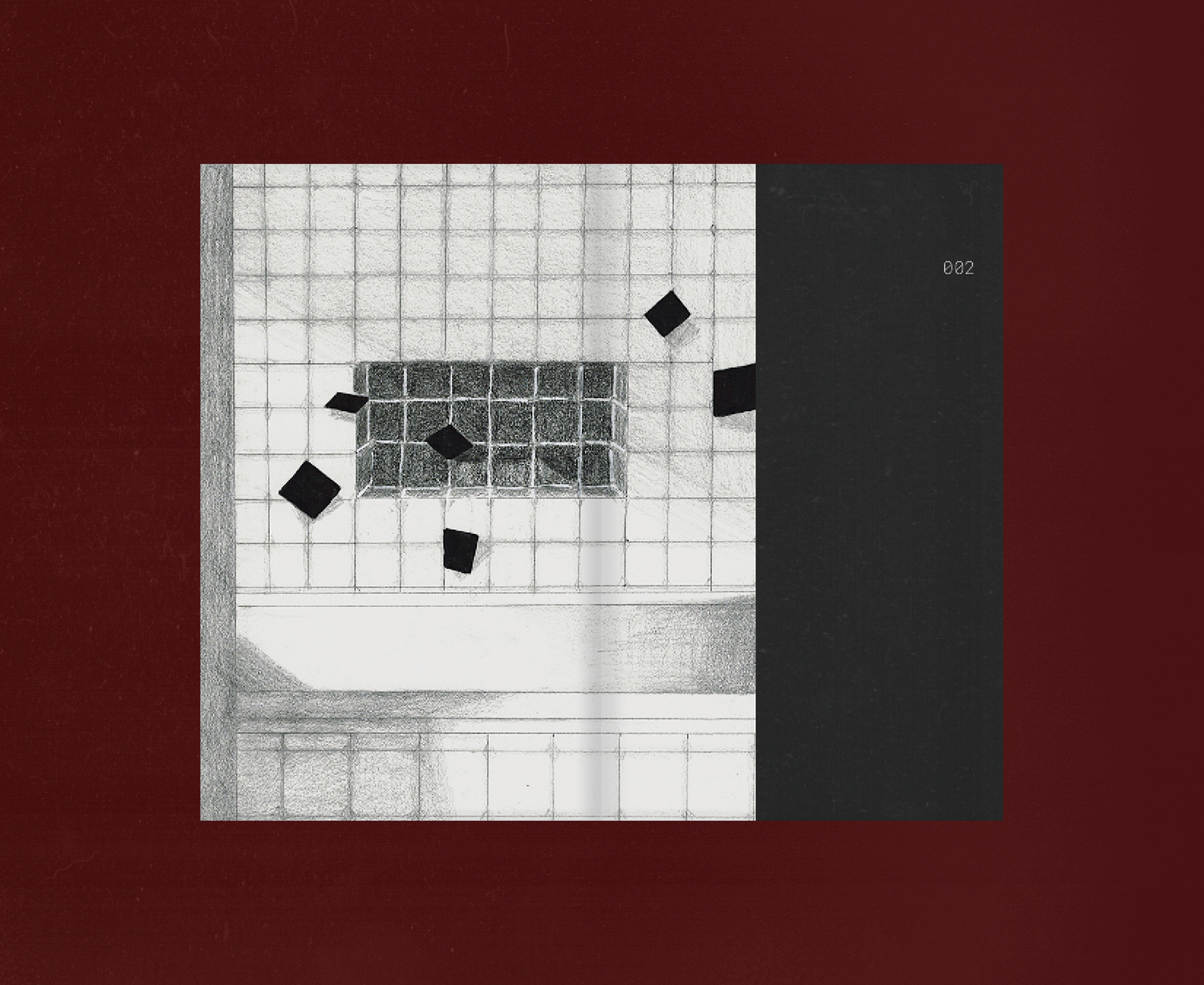
An illustration zine about memories we want to relive, sensations we want to feel again.
︎ILLUSTRATION
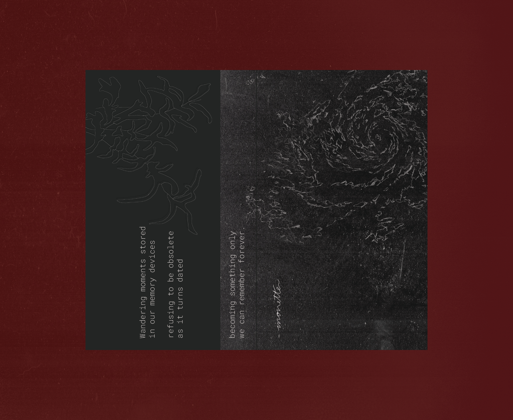
An illustration zine about memories we want to relive, sensations we want to feel again.
Modeled as a cassette tape.
“Wandering moments
stored in our memory devices
refusing to be obsolete
as it turns dated
becoming something only
we can remember forever.”
︎︎︎ SCROLL SLIDESHOW
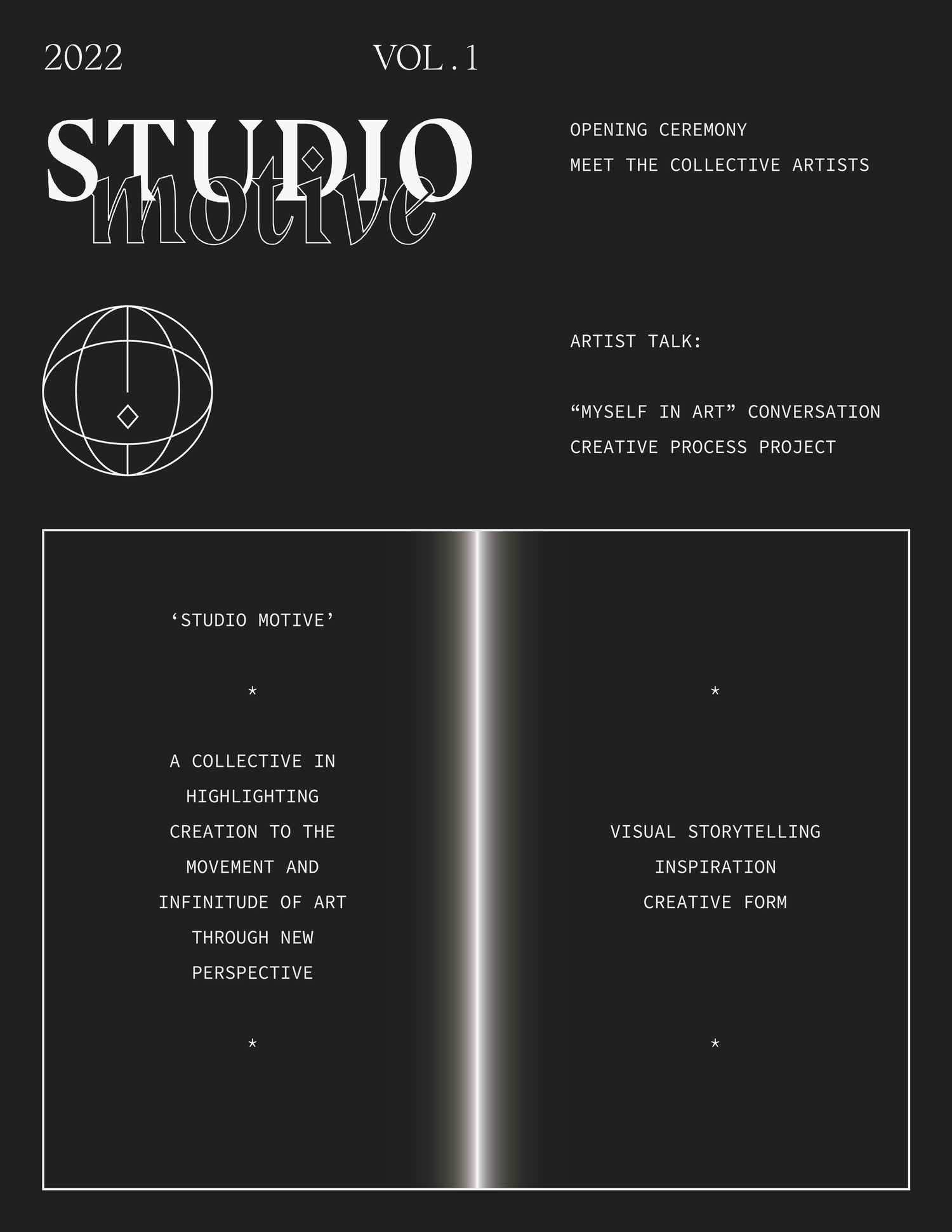
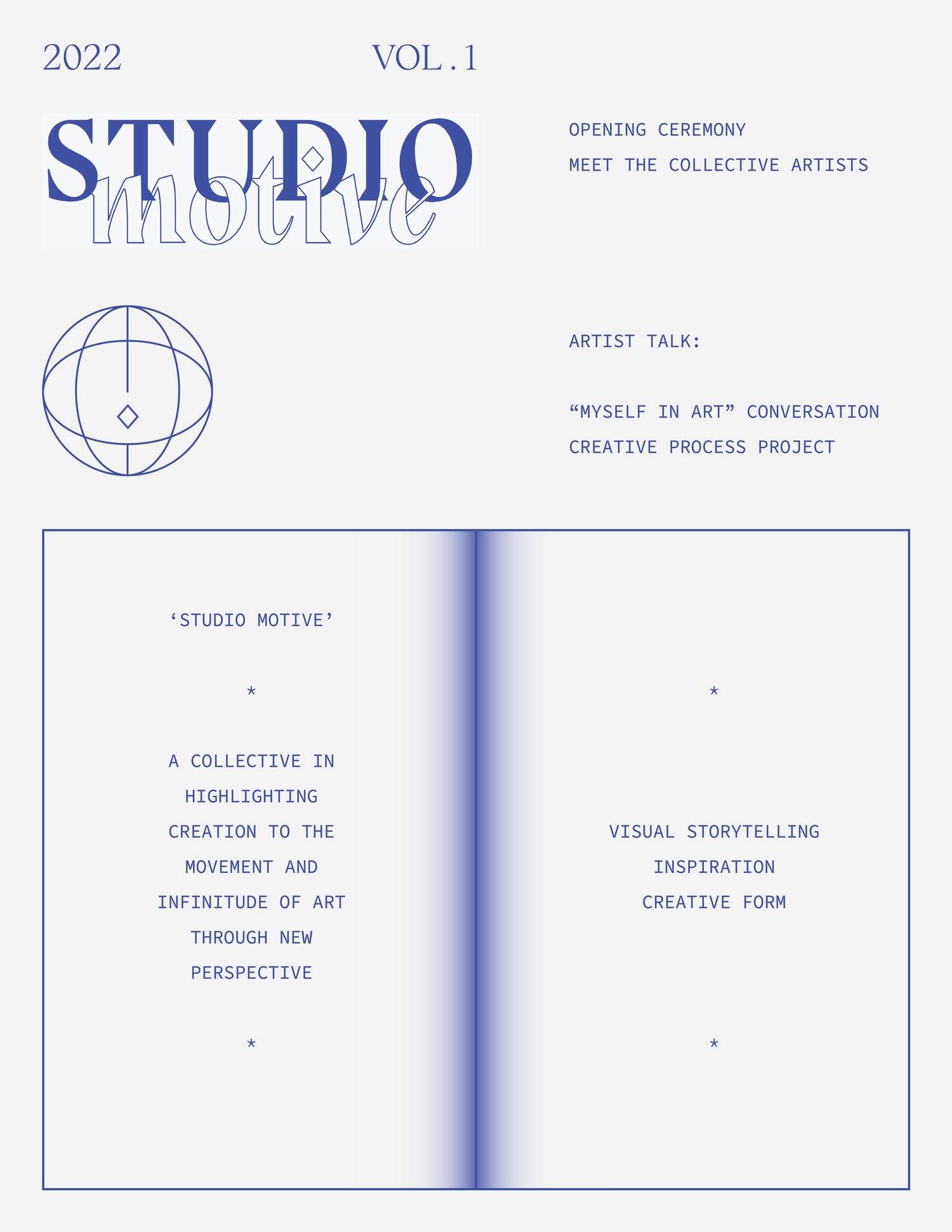
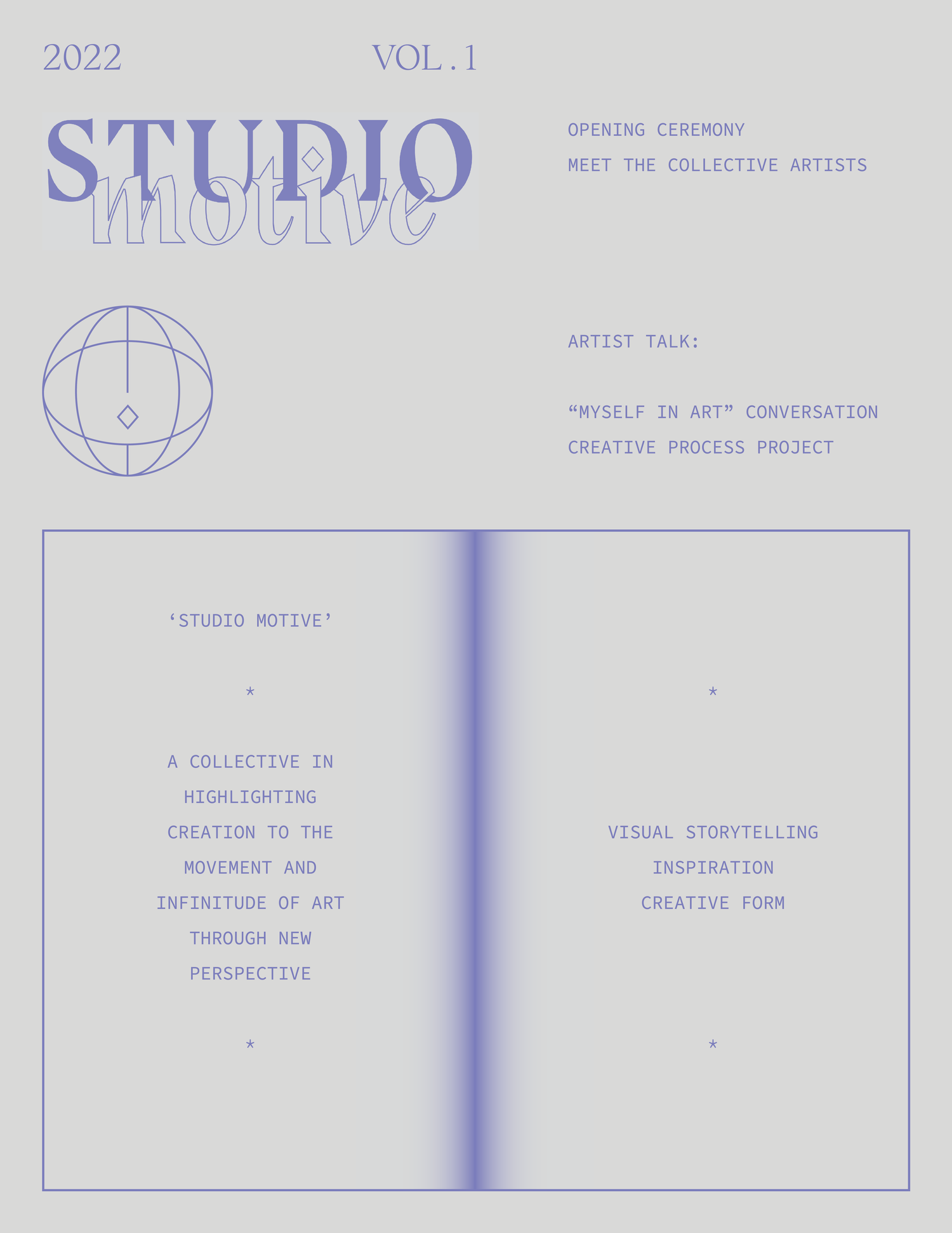
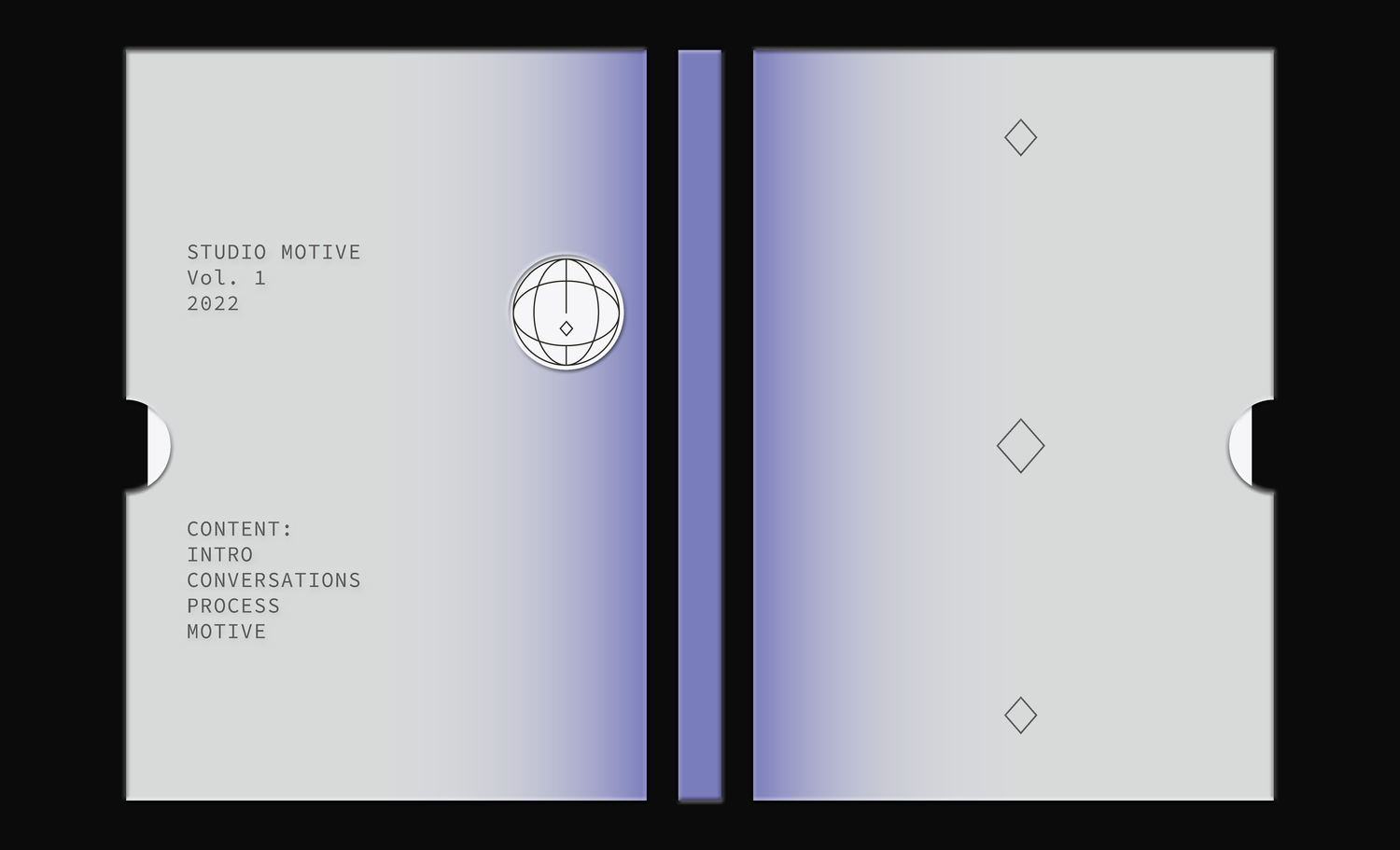
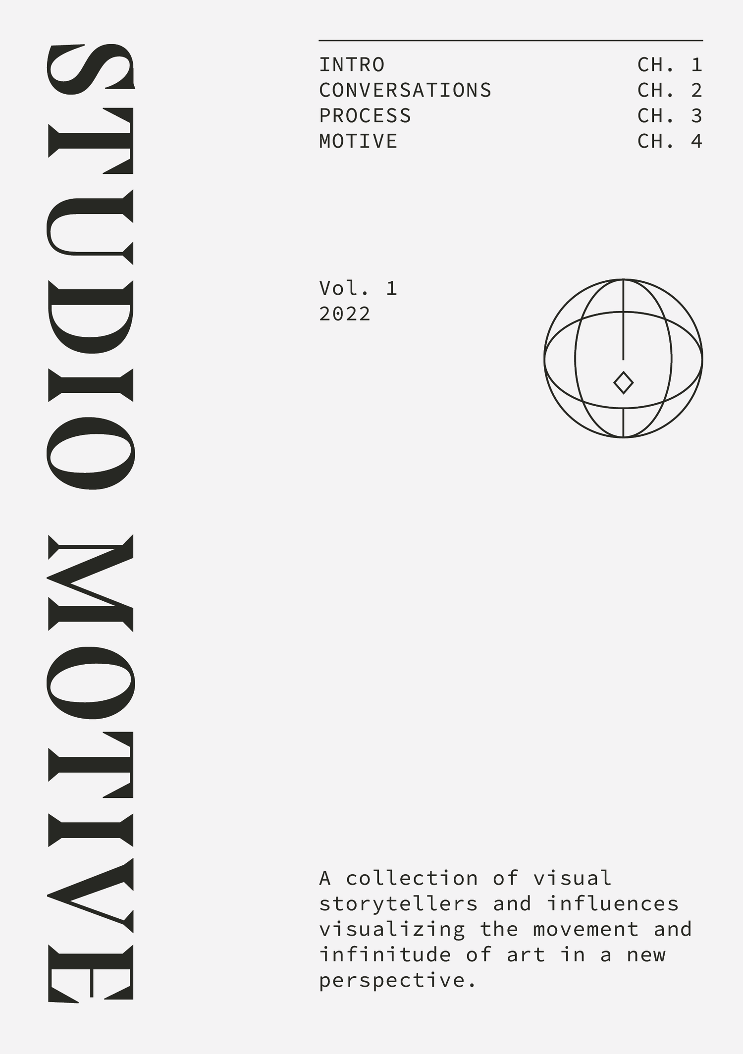
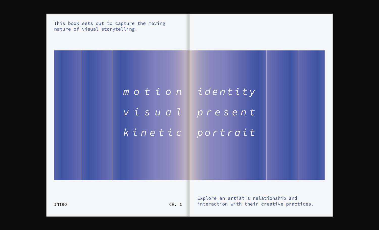
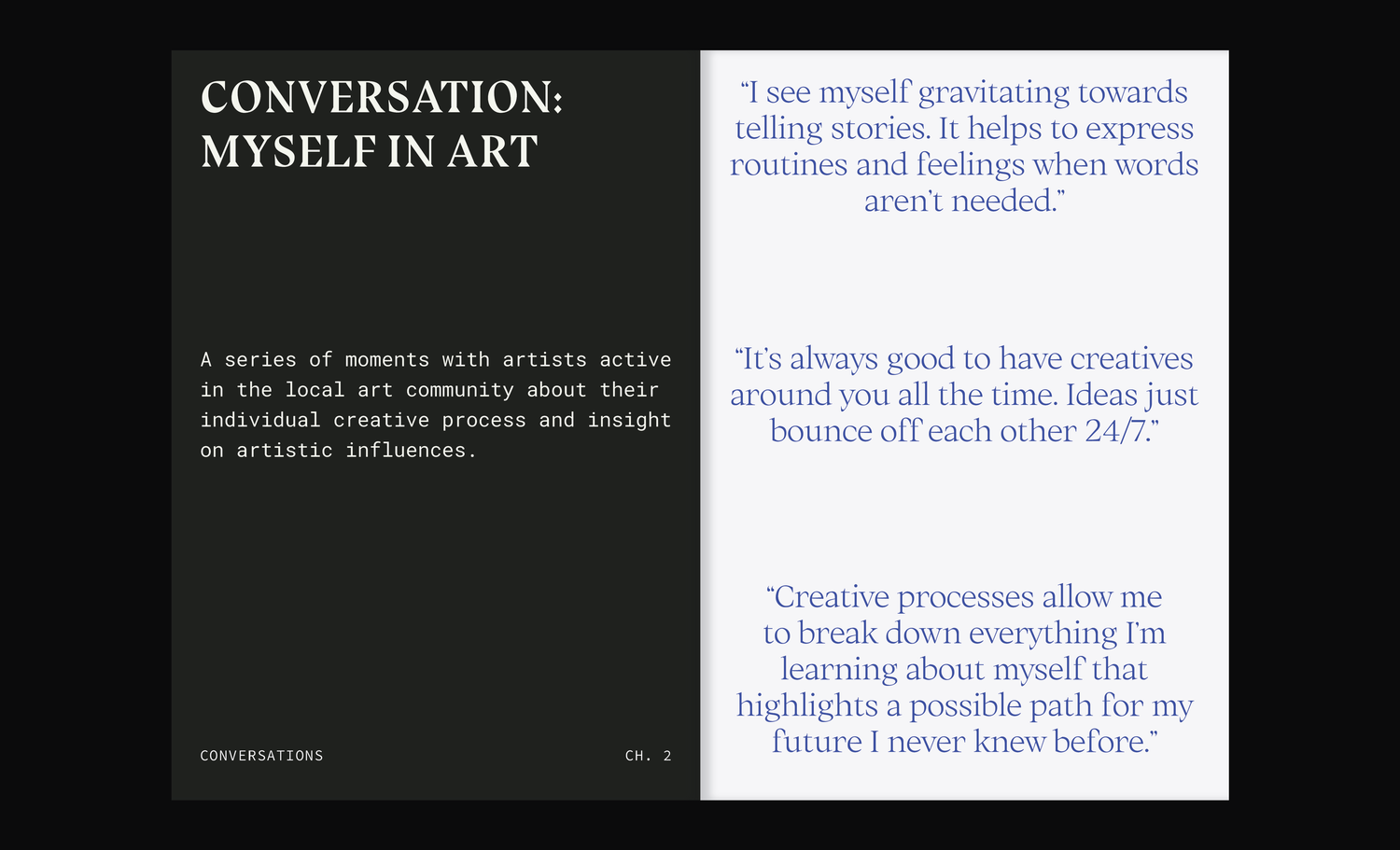
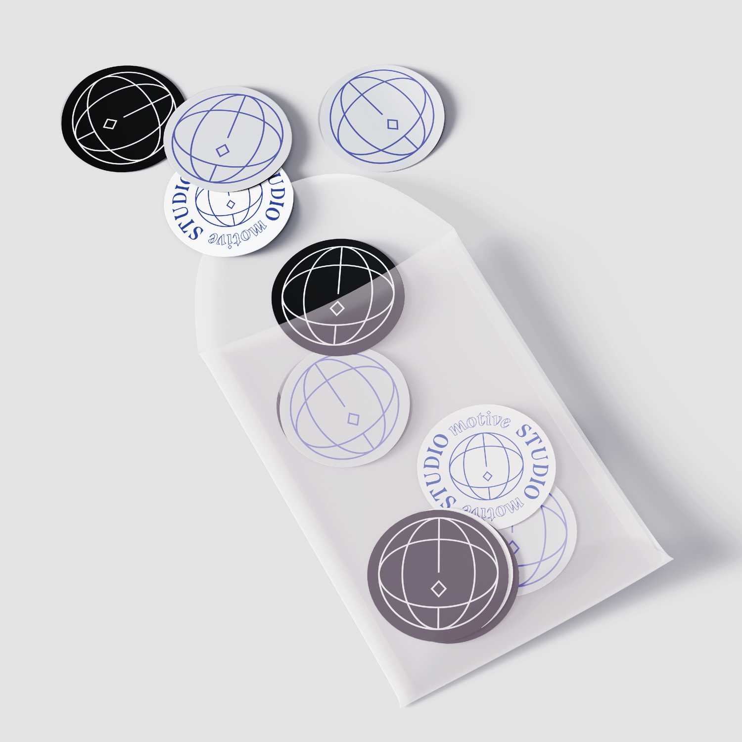
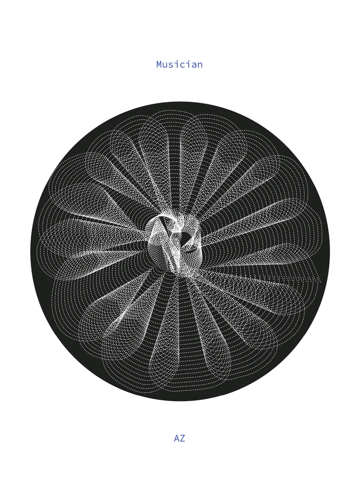
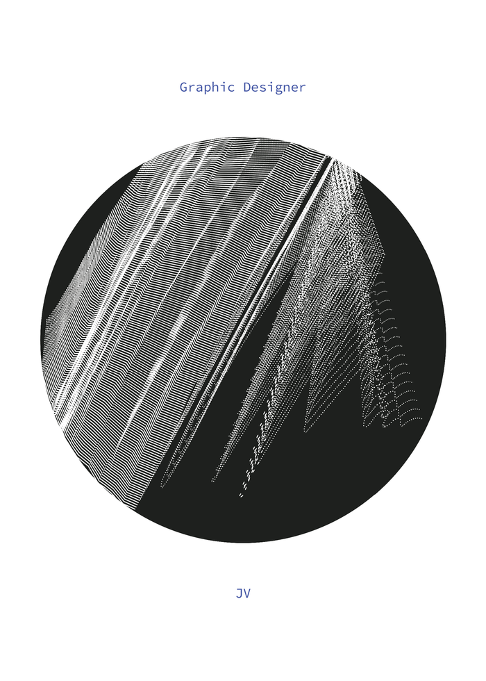
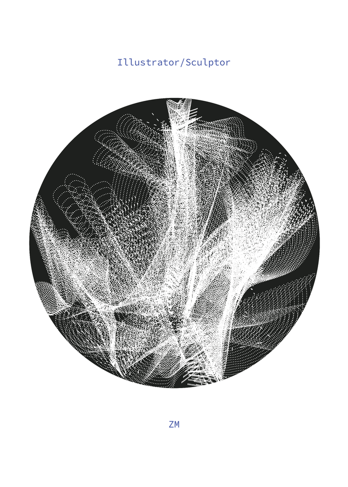
STUDIO MOTIVE
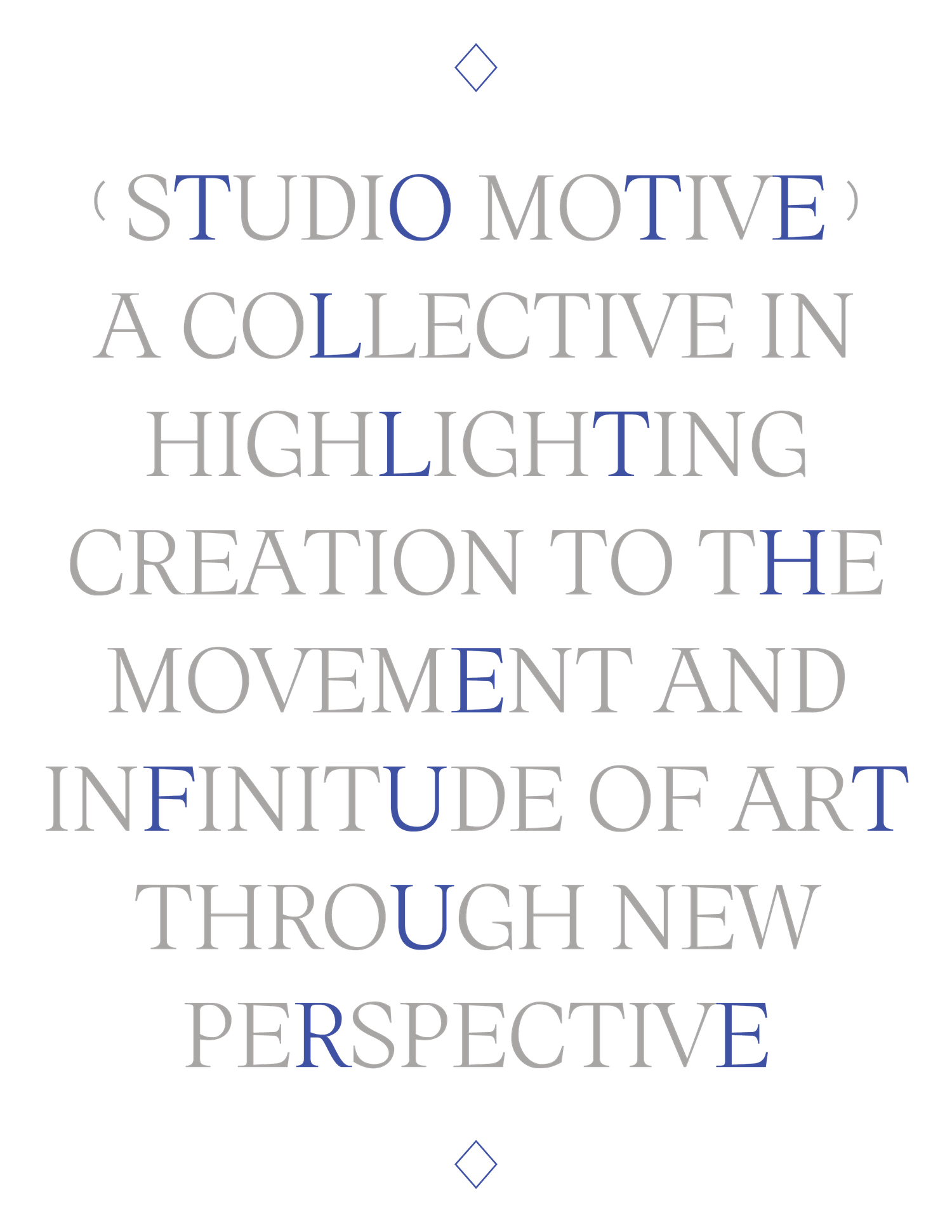
“Broadening the boundaries of art”
︎VISUAL IDENTITY
“Broadening the boundaries of art”
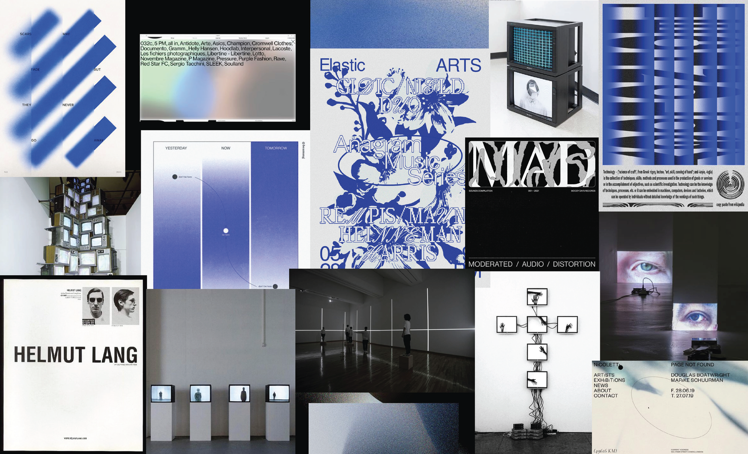
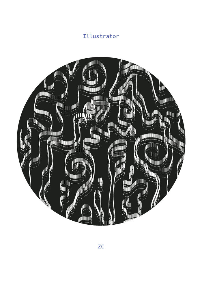
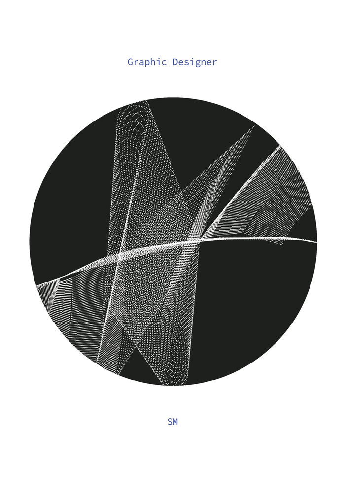
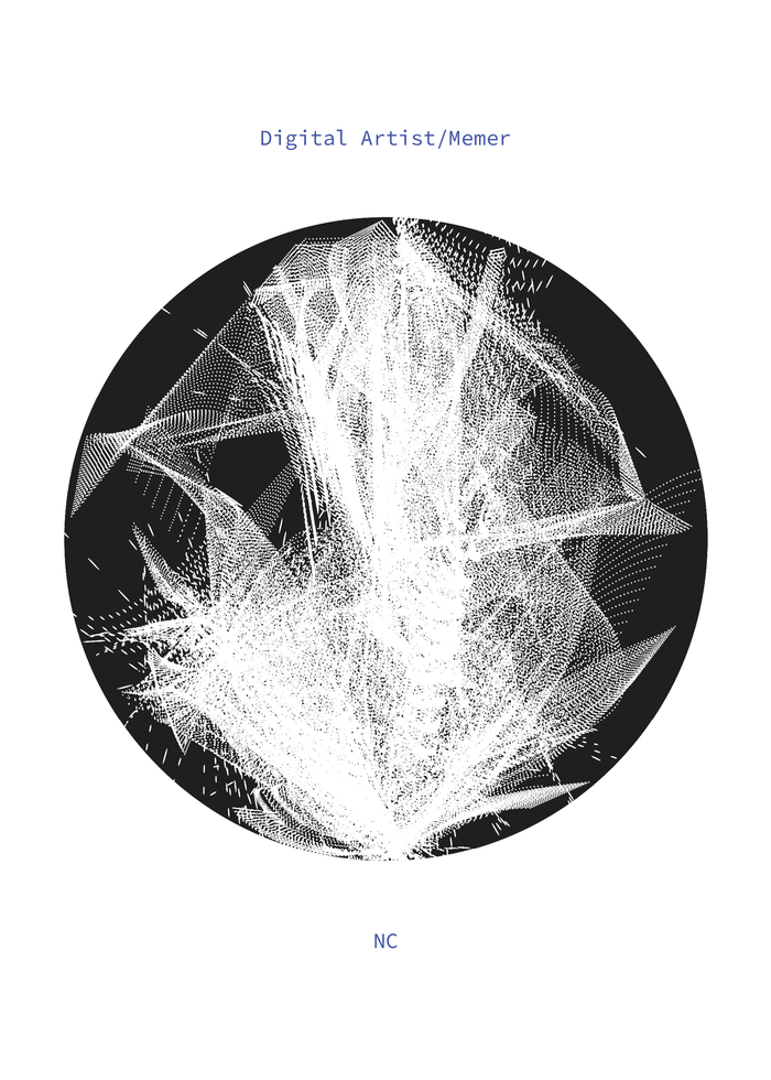
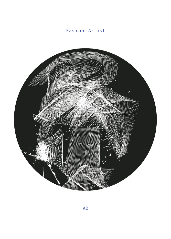
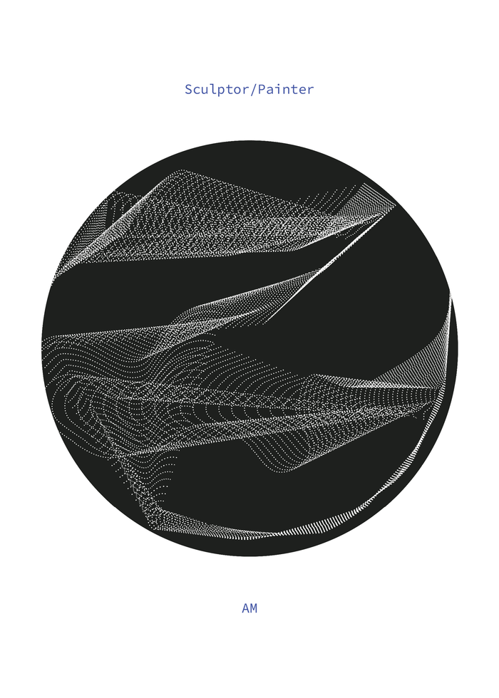
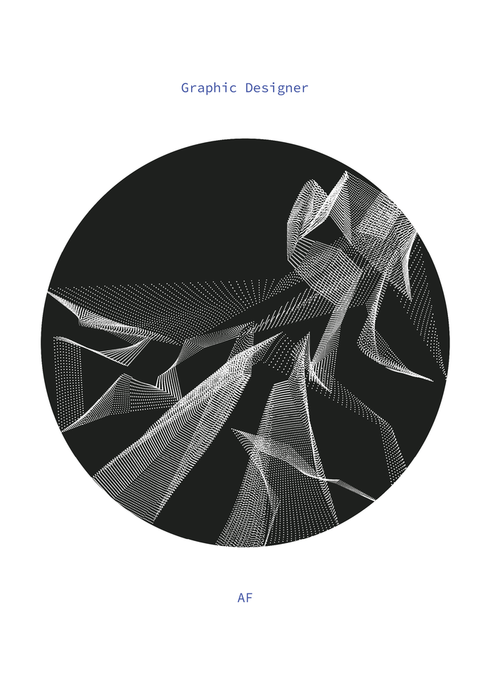
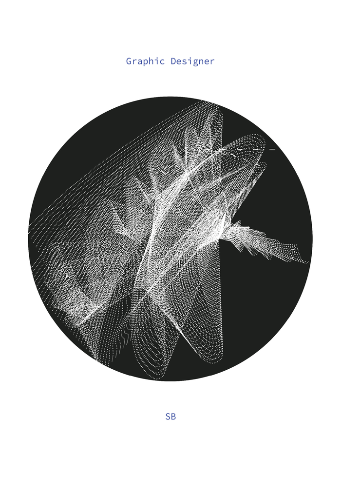
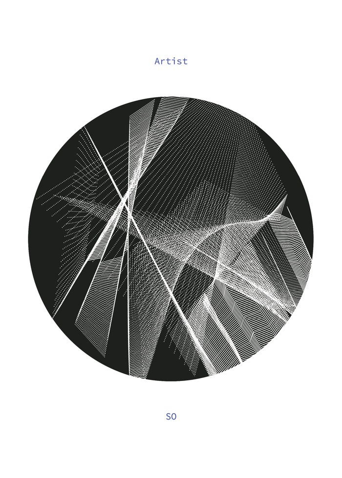
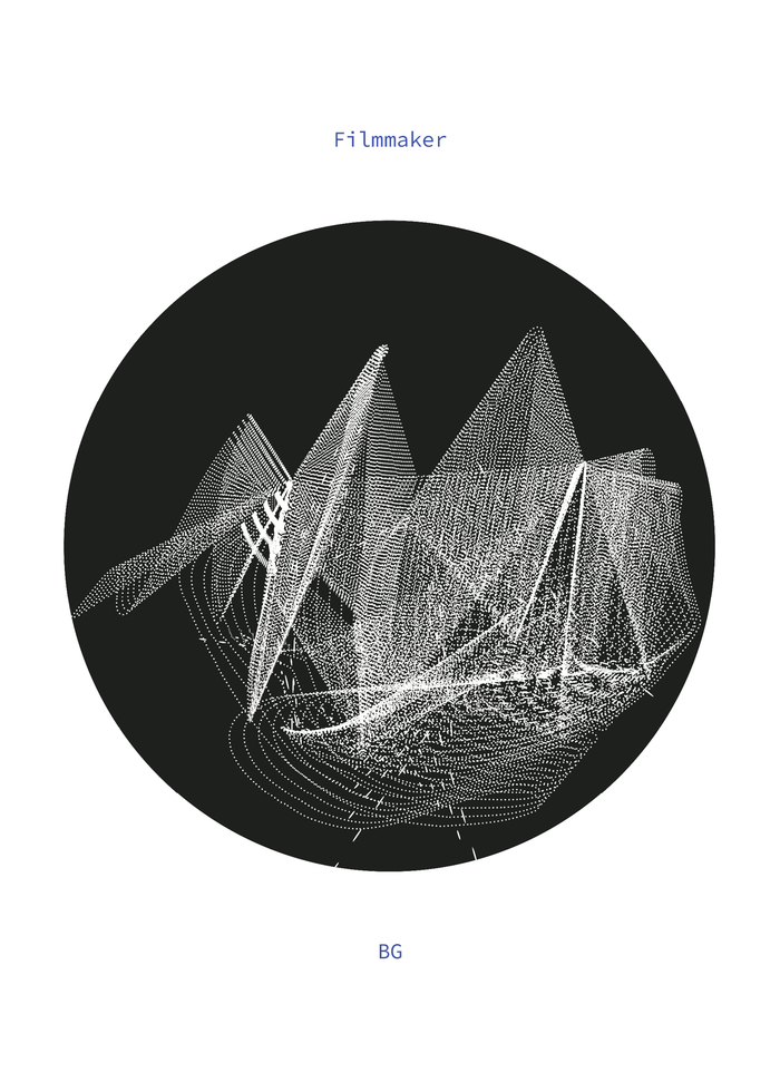
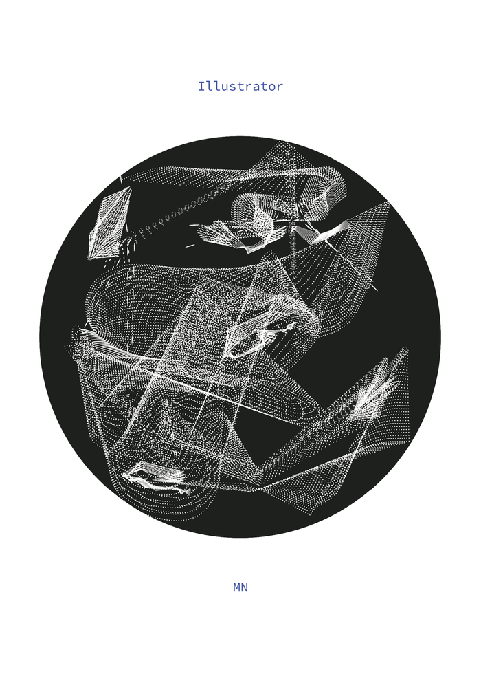
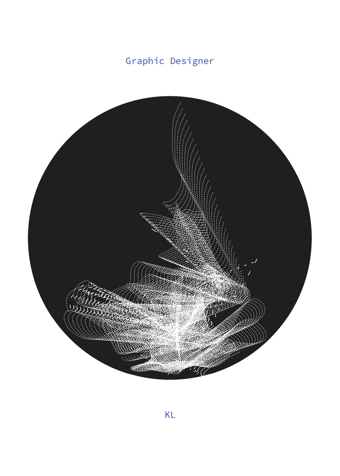
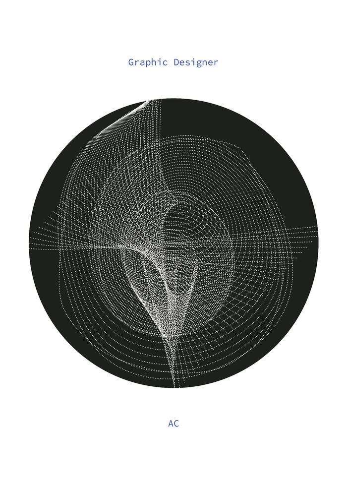
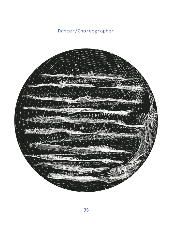
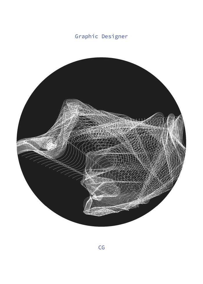
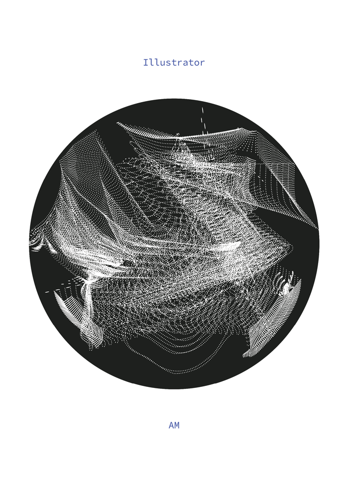
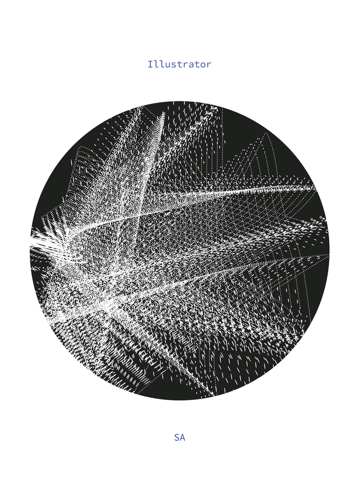
A creative platform celebrating the work of visual storytellers who are part of the design, photography, film, dance, and fashion industry.
It seeks to recognize a collective of artists who draw deeper engagement related to arts and inspire visual storytelling, form, and movement.
︎︎︎ SCROLL SLIDESHOW



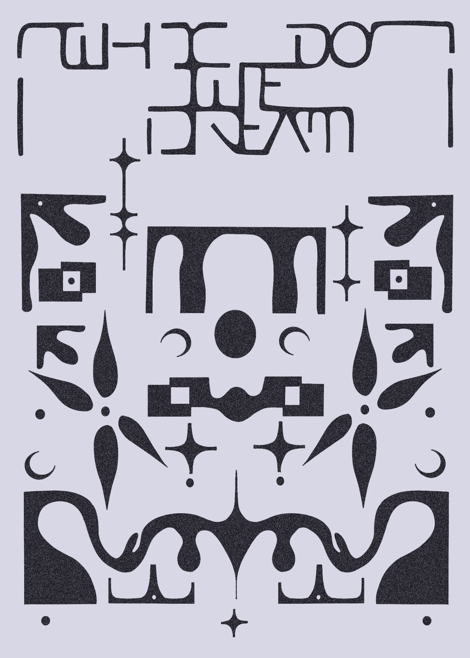
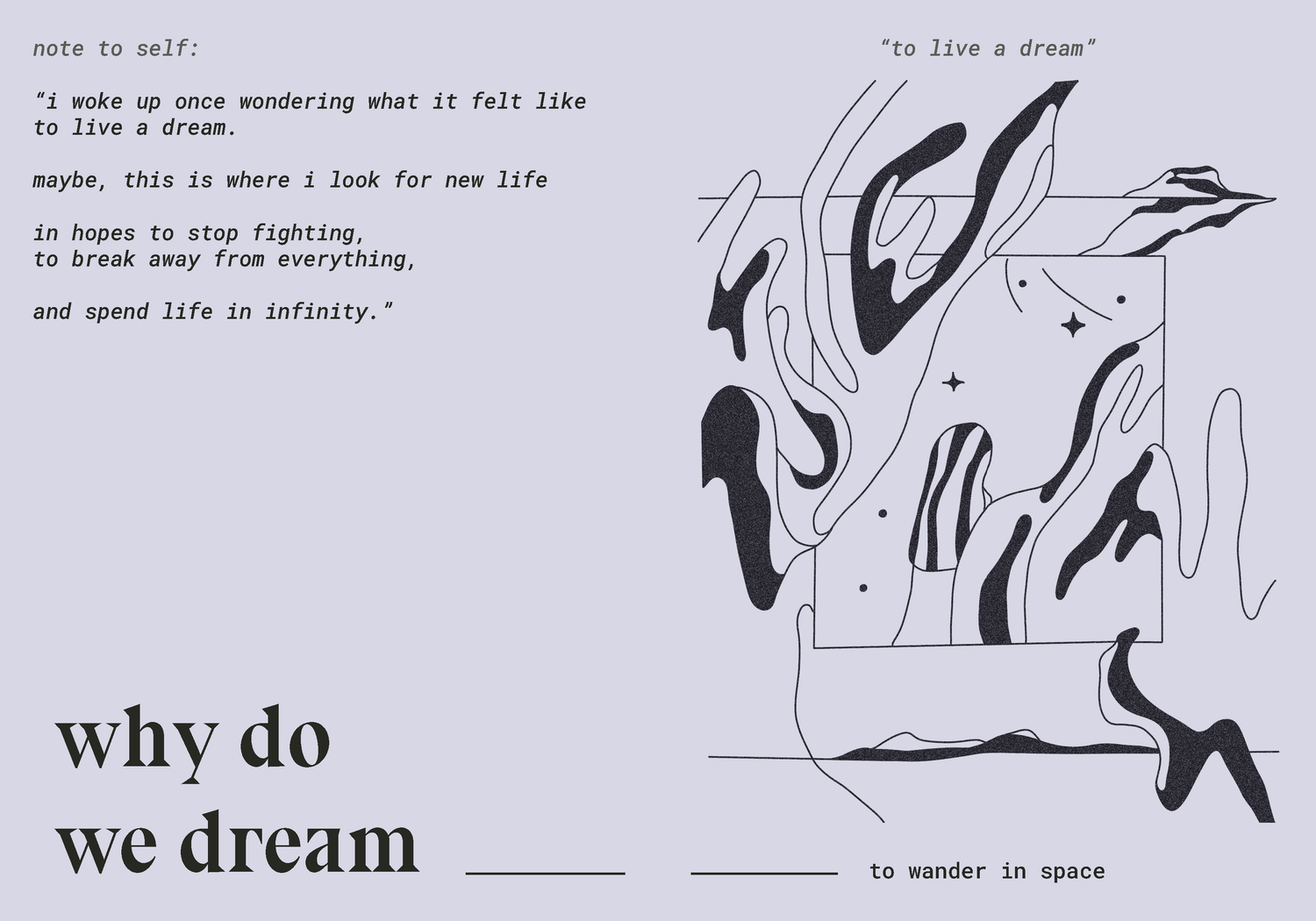
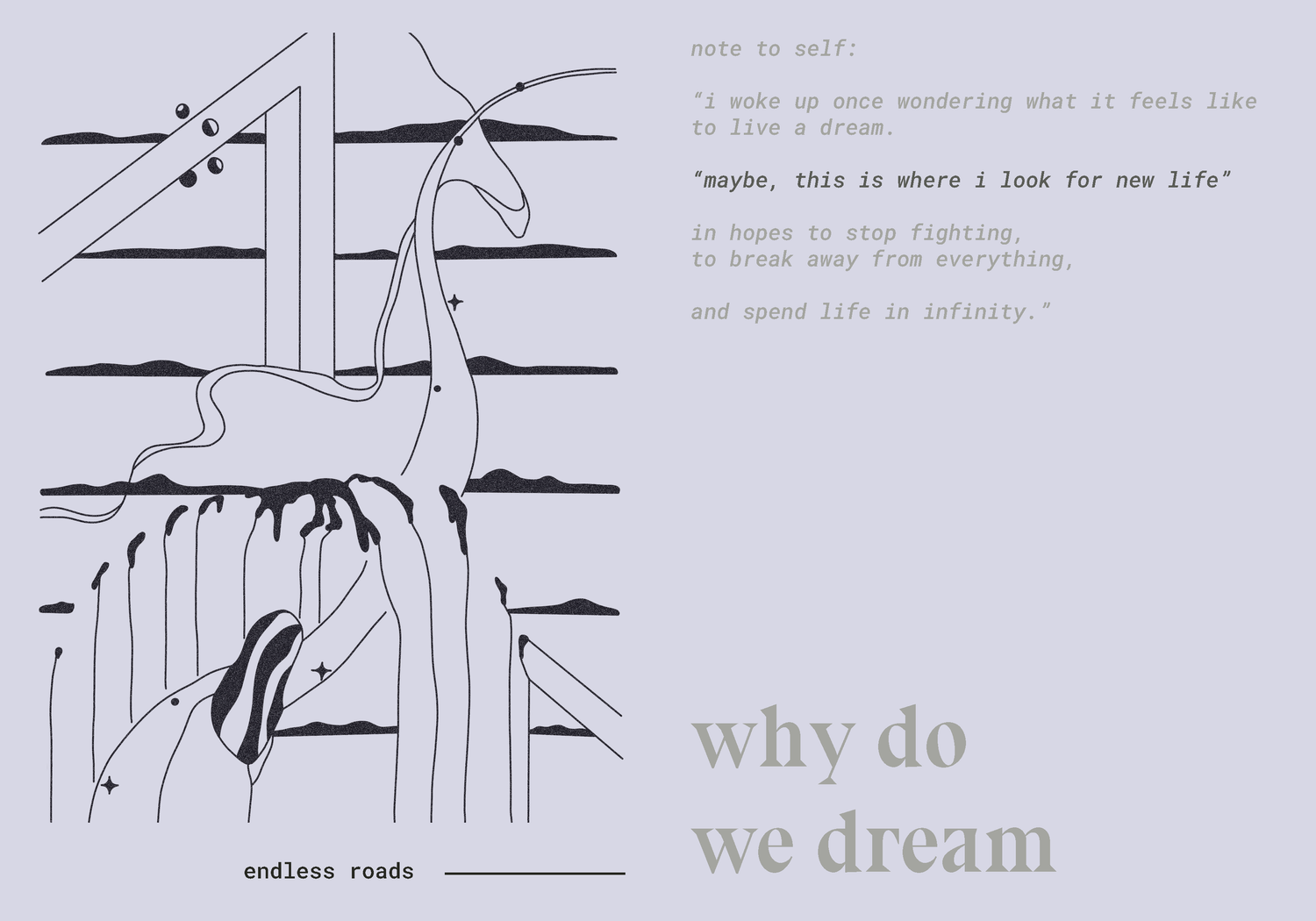
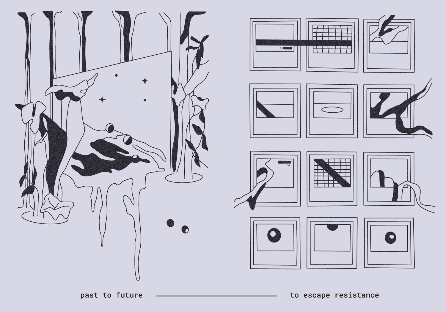
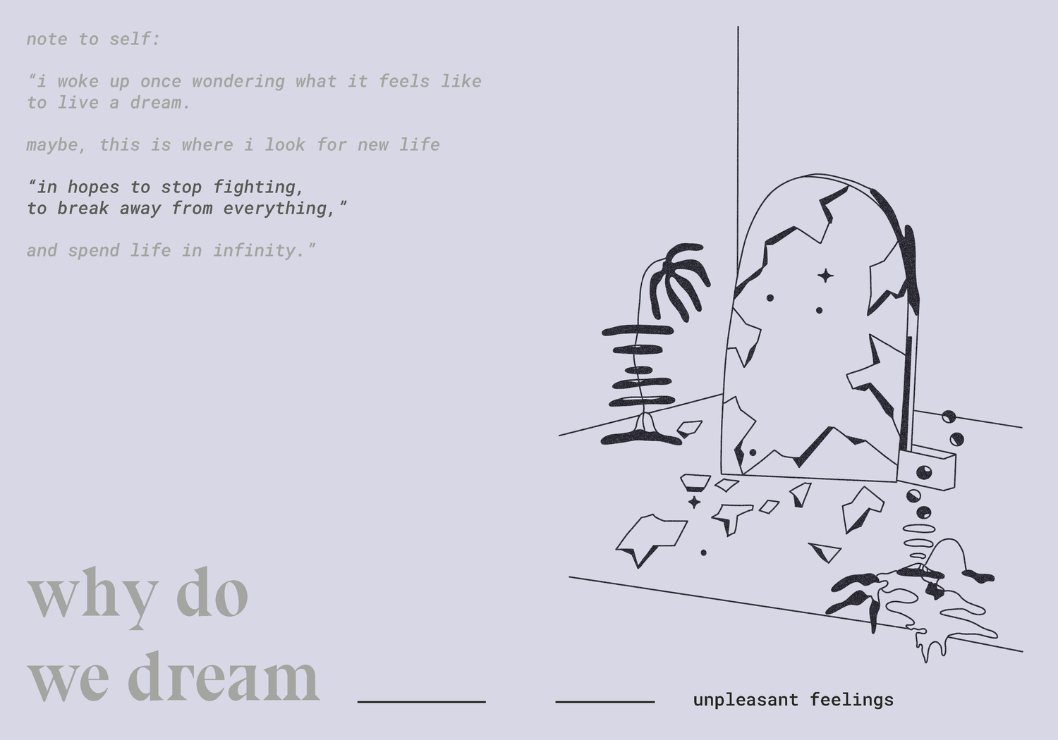
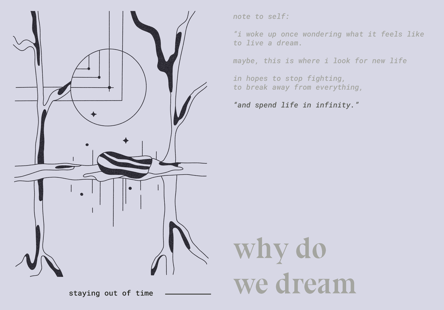
WHY DO WE DREAM
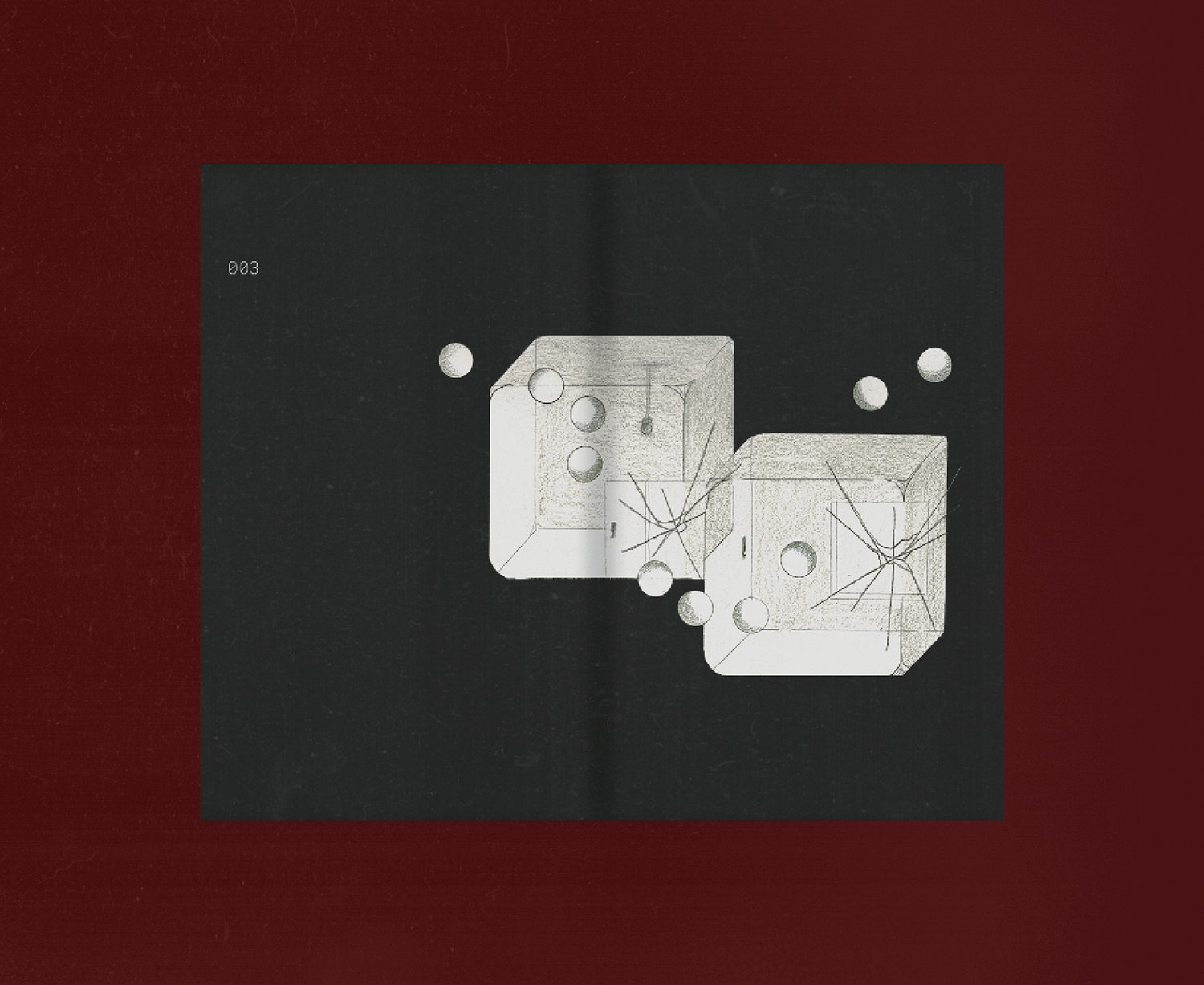
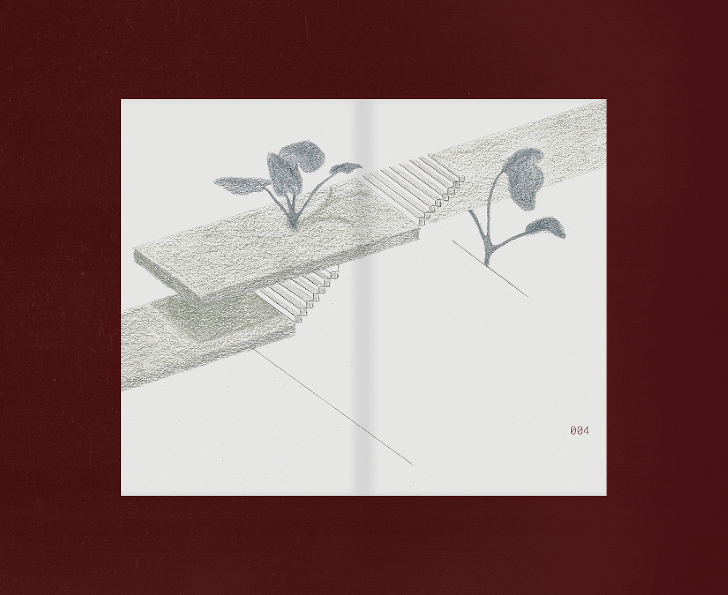
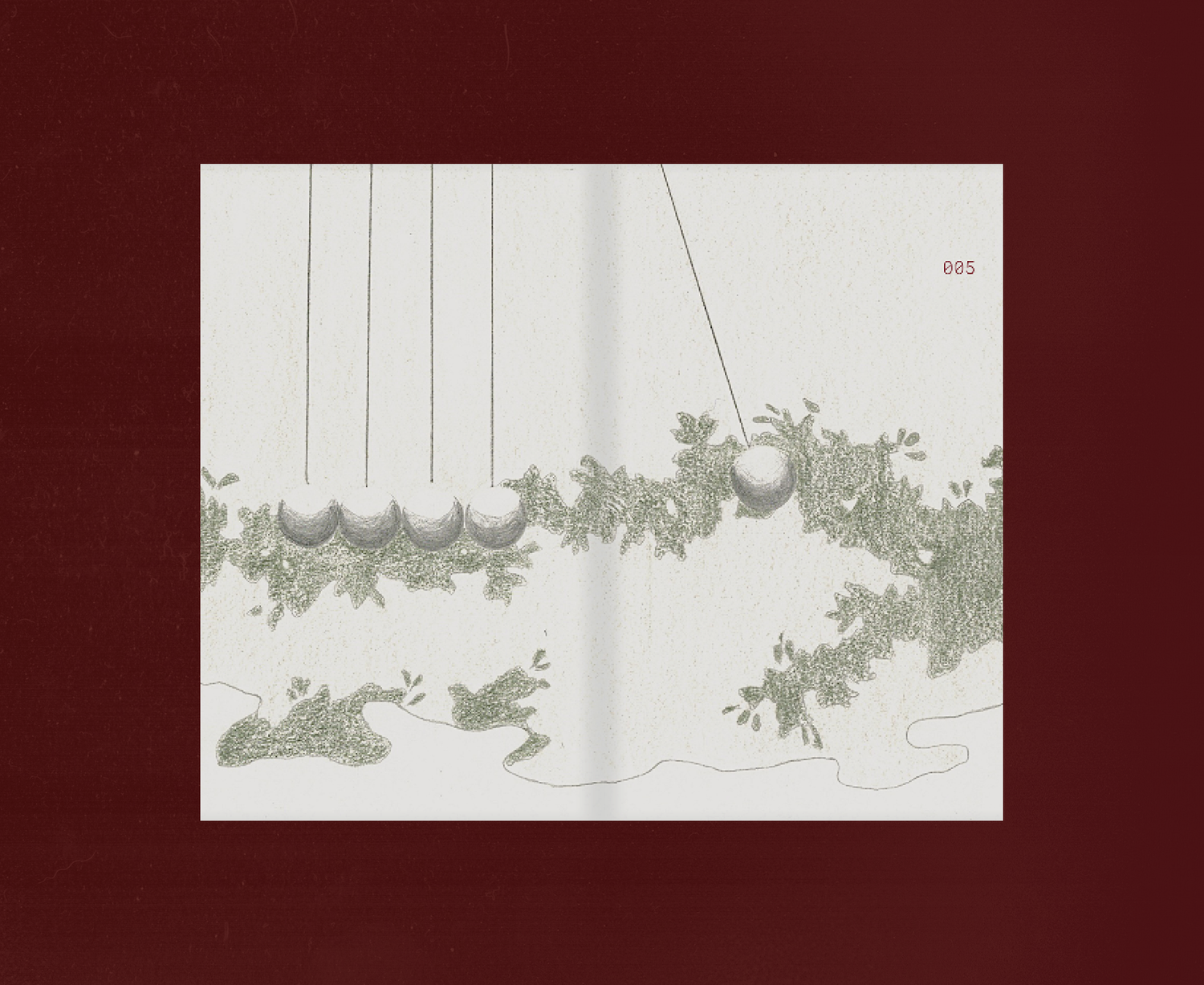
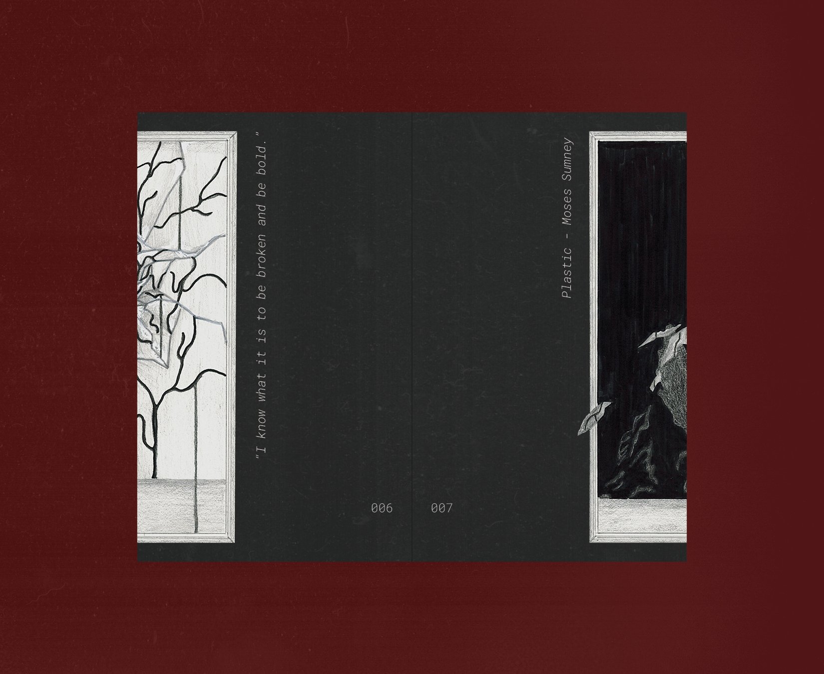
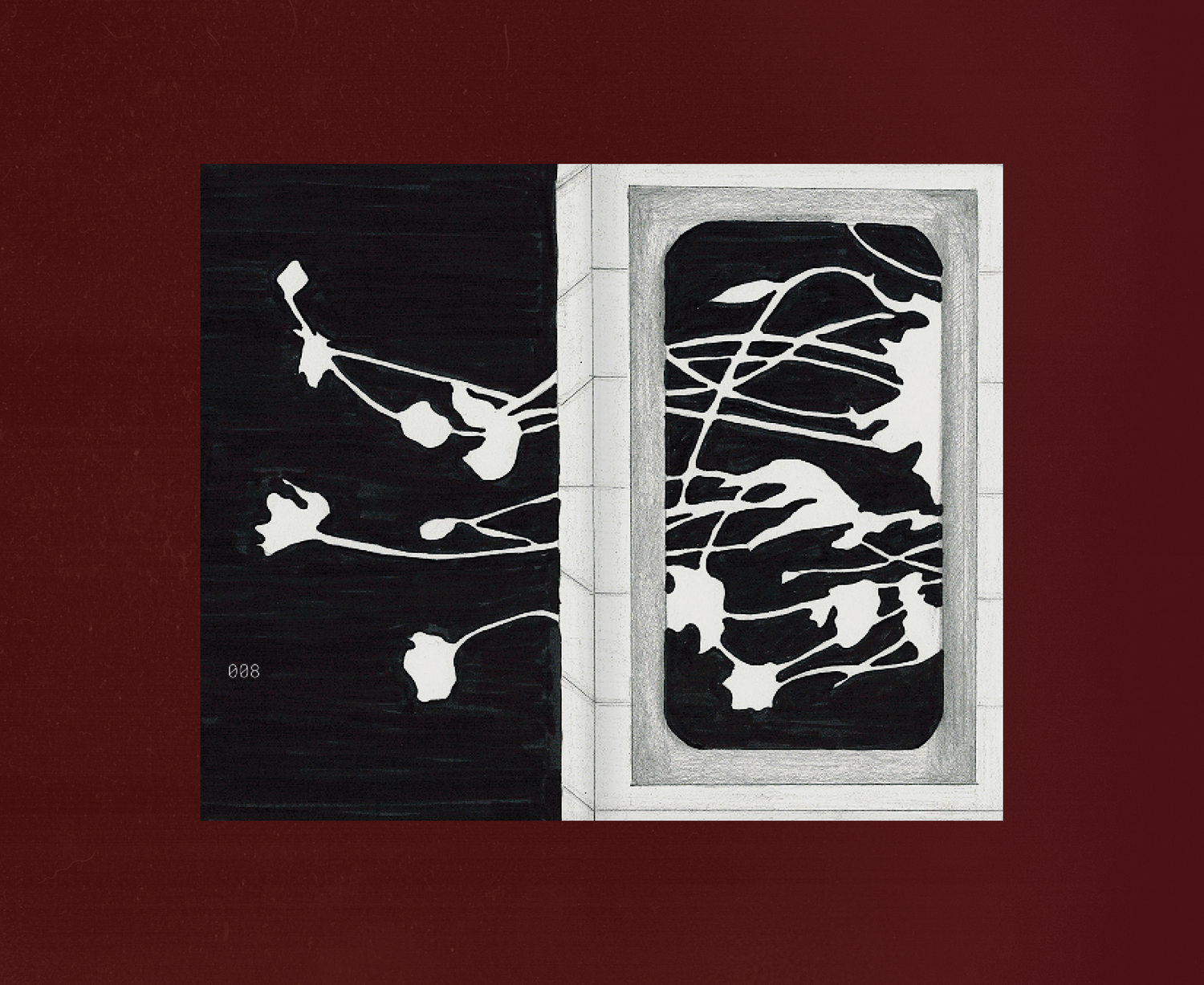
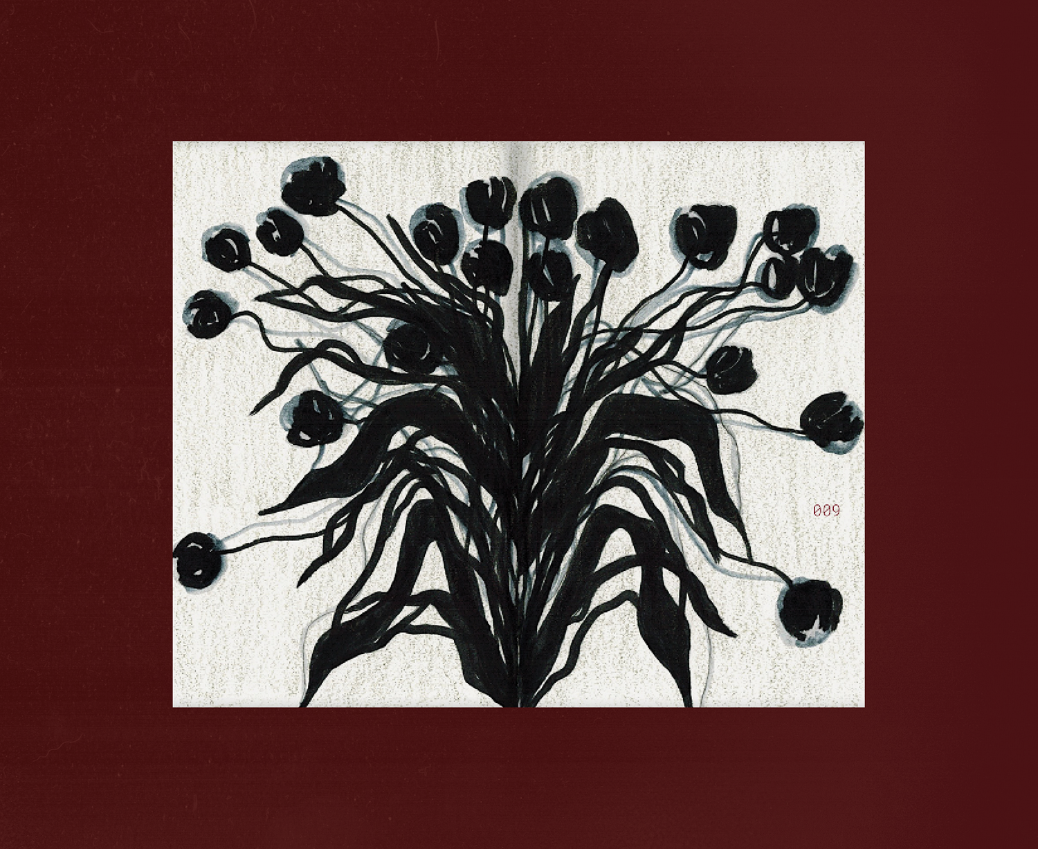
An illustration zine about humans exploring dreamscapes, an alternate reality that offers a form of escapism.
︎ILLUSTRATION
An illustration zine about humans exploring dreamscapes, an alternate reality that offers a form of escapism.
“i woke up once
wondering what it felt like
to live a dream.
maybe, this is where
i look for new life
in hopes to stop fighting,
to break away from everything,
and spend life in infinity.”
︎︎︎ SCROLL SLIDESHOW
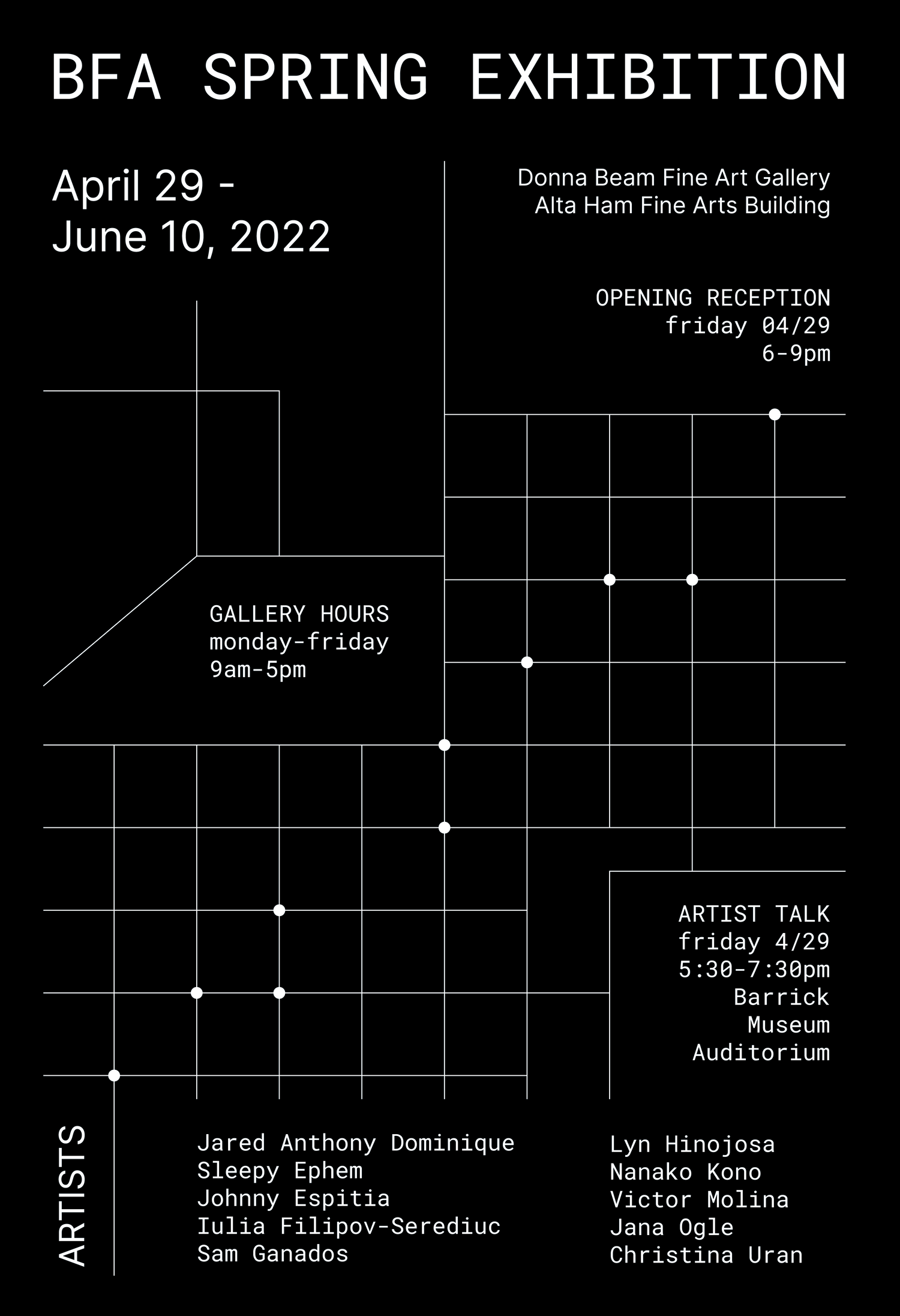
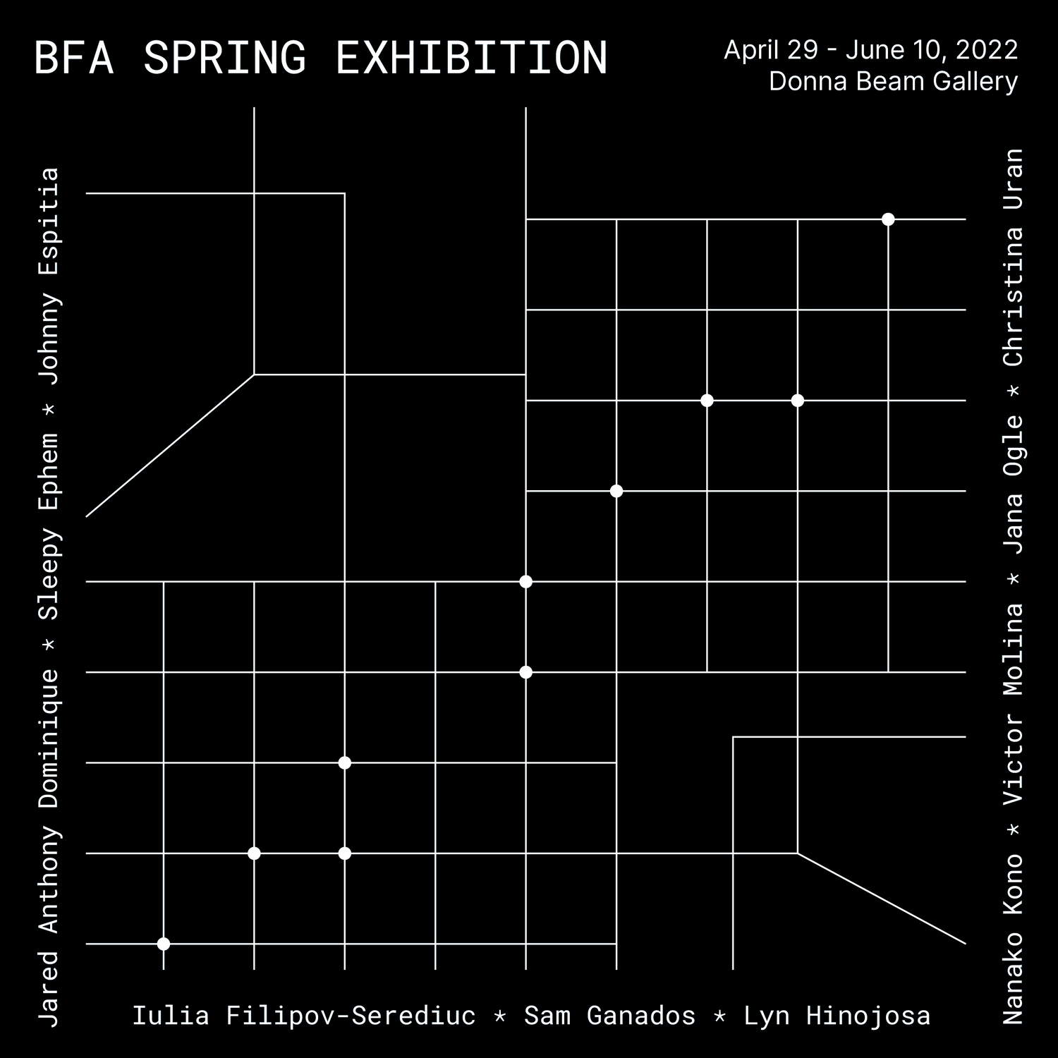
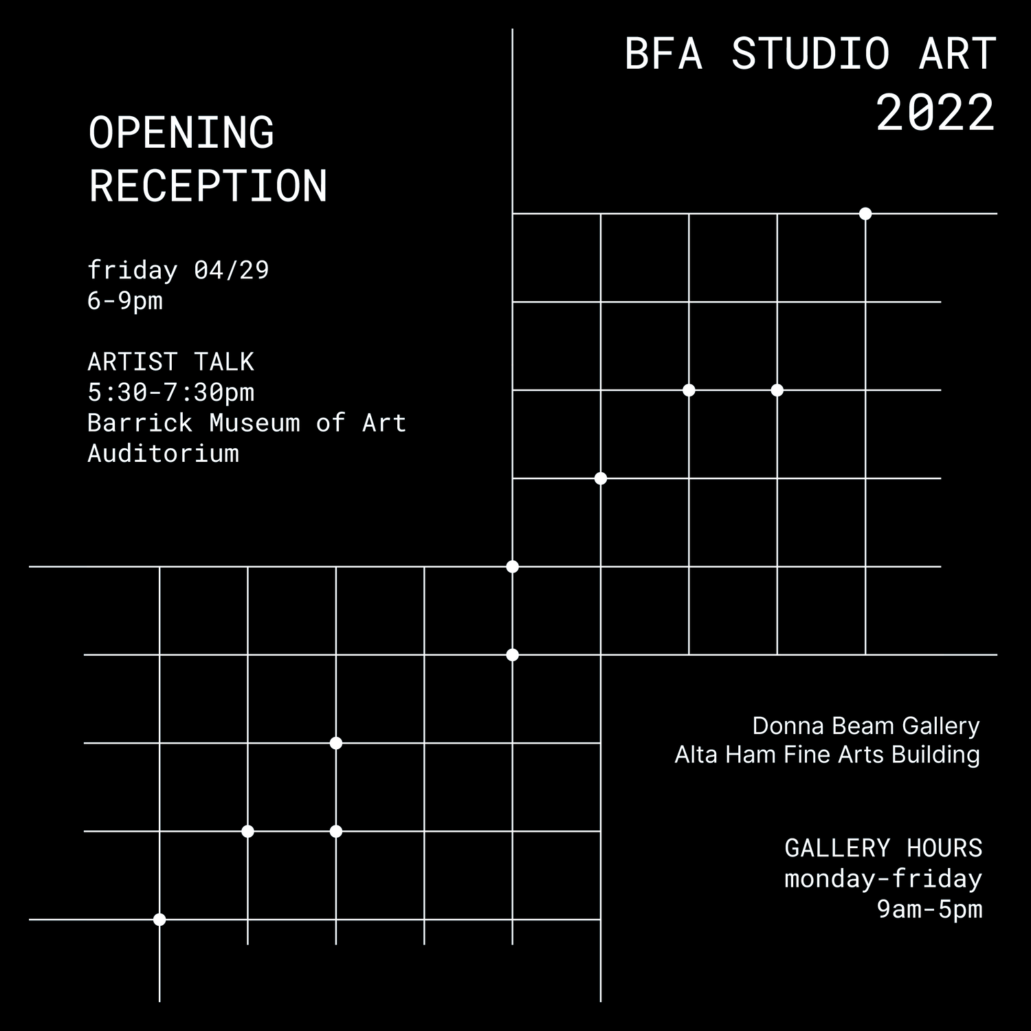
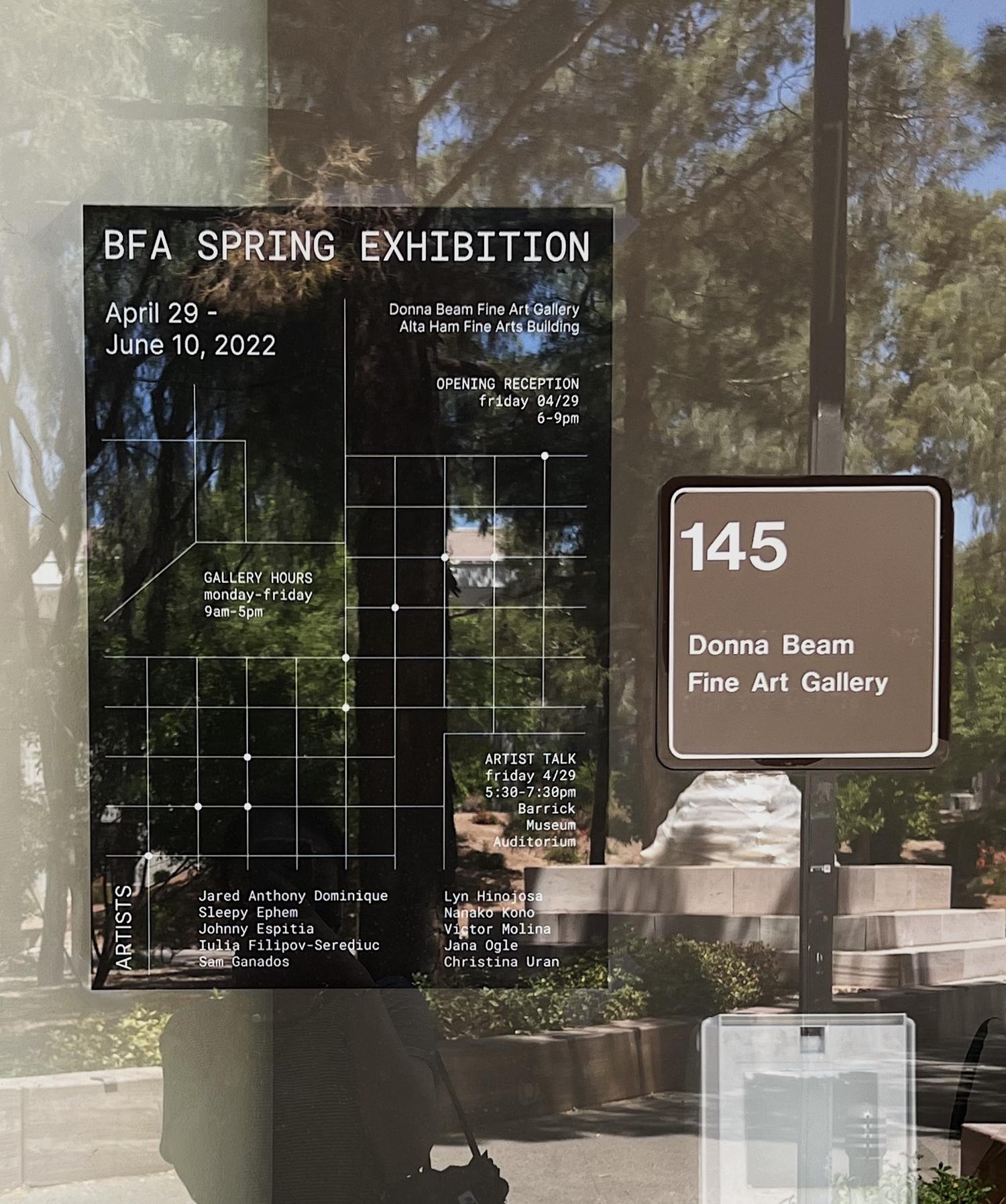
BFA SPRING EXHIBITION
︎CREATIVE DIRECTION
︎︎︎ SCROLL SLIDESHOW
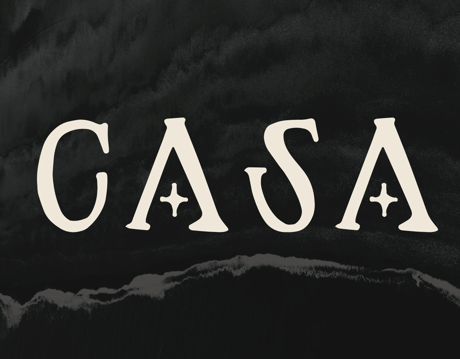
CASA TYPEFACE
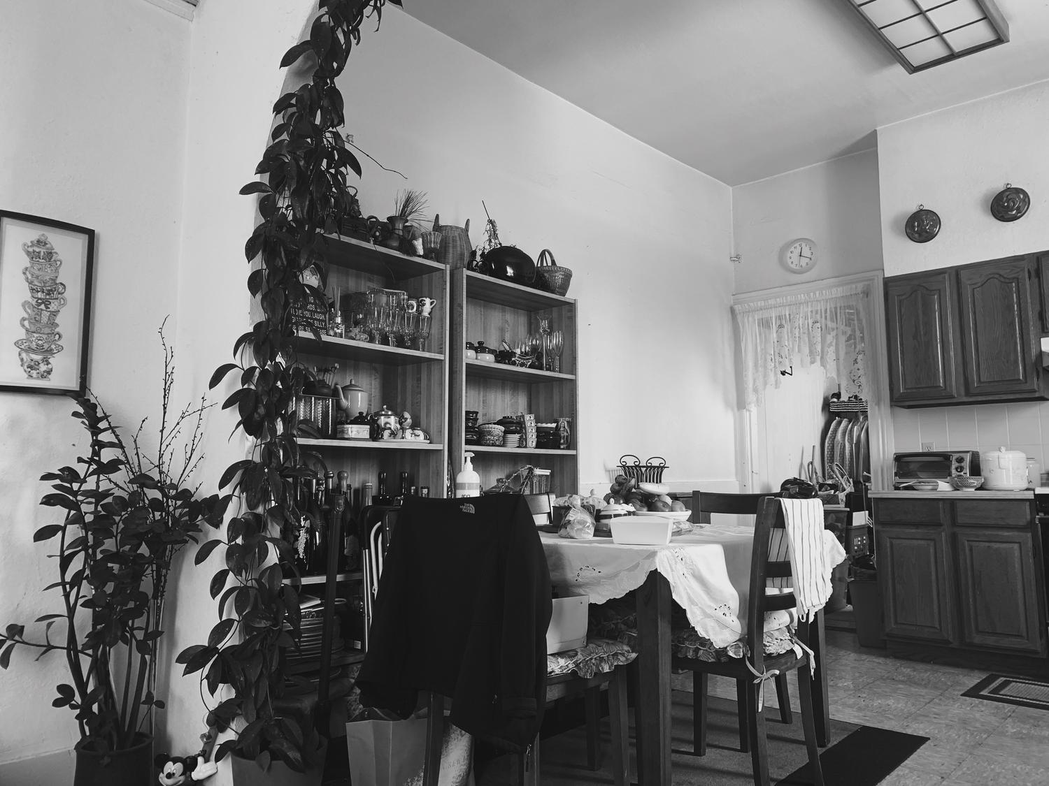
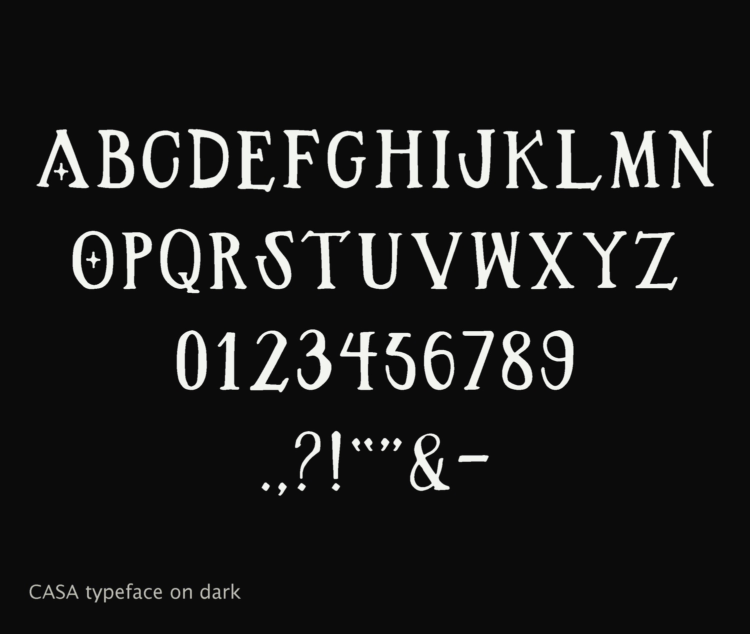
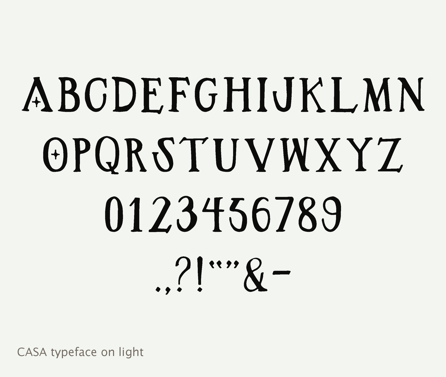
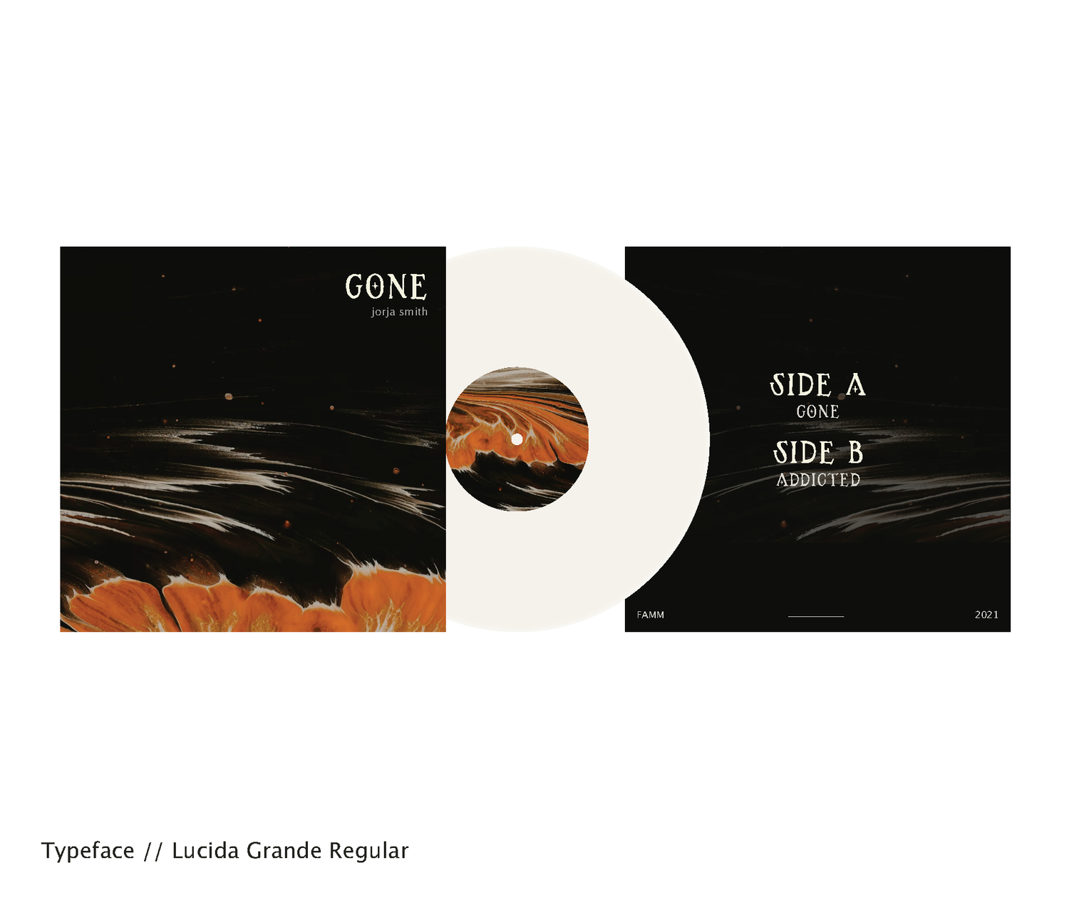
Inspired by Monette’s childhood home within the city of San Francisco, Casa is a calligraphic typeface created to translate the meaning of home and the noise the physical space it exudes.
︎TYPOGRAPHY
Inspired by Monette’s childhood home within the city of San Francisco, Casa is a calligraphic typeface created to translate the meaning of home and the noise the physical space it exudes.
The concept relates to using typography to express personal emotion. The asymmetric nature of the shapes and bold strokes represent imperfection as well as our emotional attachment to nostalgia.
︎︎︎ SCROLL SLIDESHOW
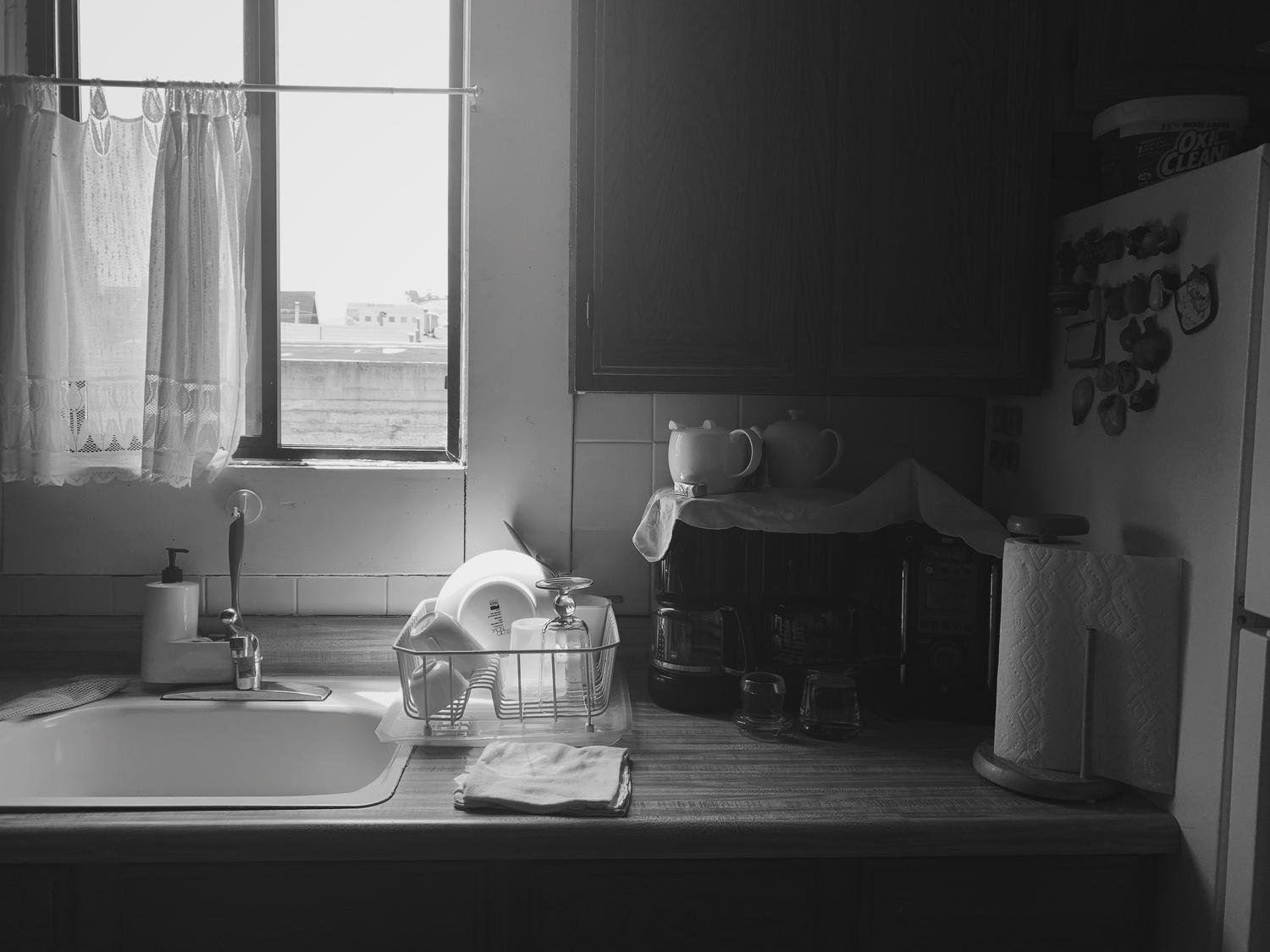

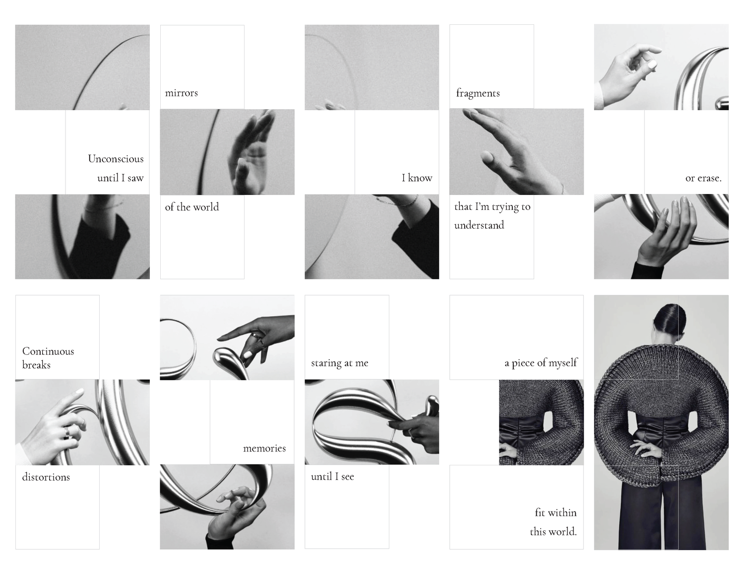
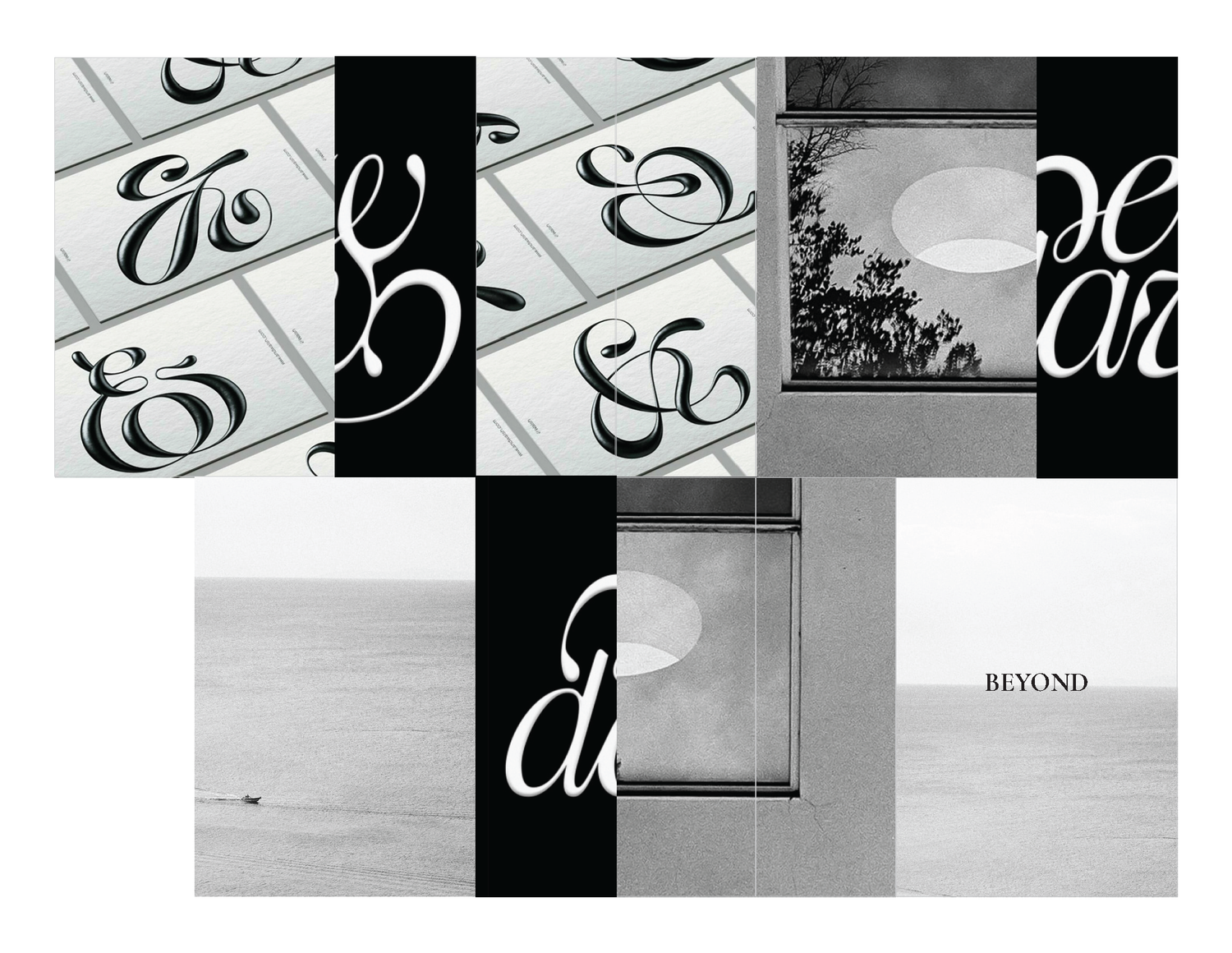
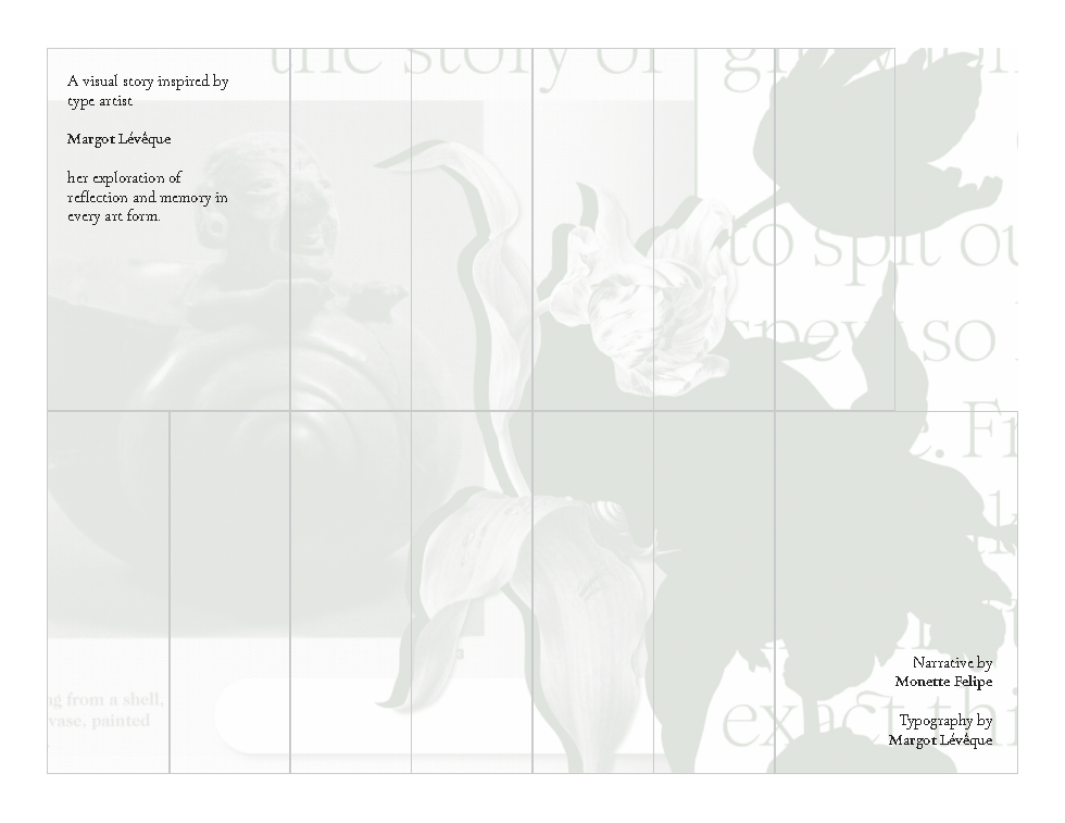
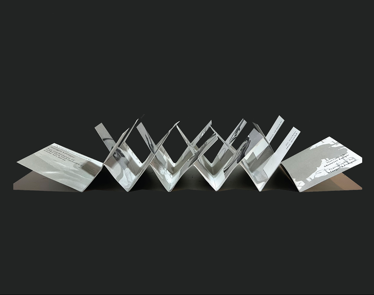
BEYOND FLAGBOOK
Inspired by French graphic and type designer, Margot Lévêque and her exploration of visual identity in art and editorial, ‘Beyond’ is a visual story about recognizing our memories and reflections related to the present.
︎PRINT DESIGN
Inspired by French graphic and type designer, Margot Lévêque and her exploration of visual identity in art and editorial, ‘Beyond’ is a visual story about recognizing our memories and reflections related to the present.
Narrative by Monette Felipe
Typography by Margot Lévêque
︎︎︎ SCROLL SLIDESHOW

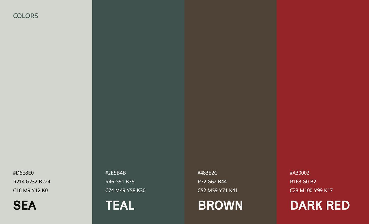
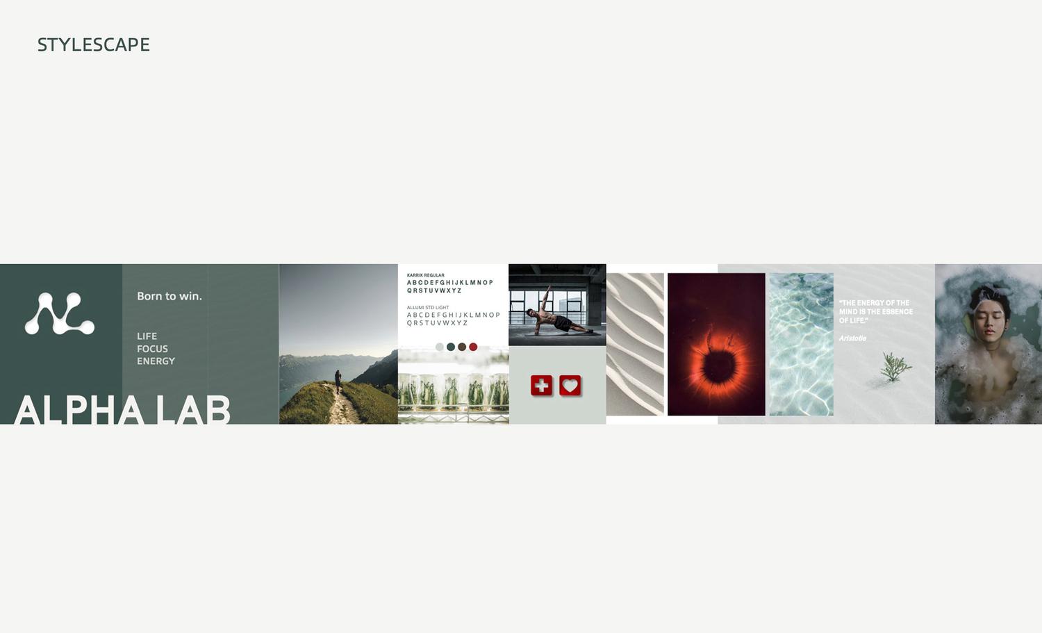
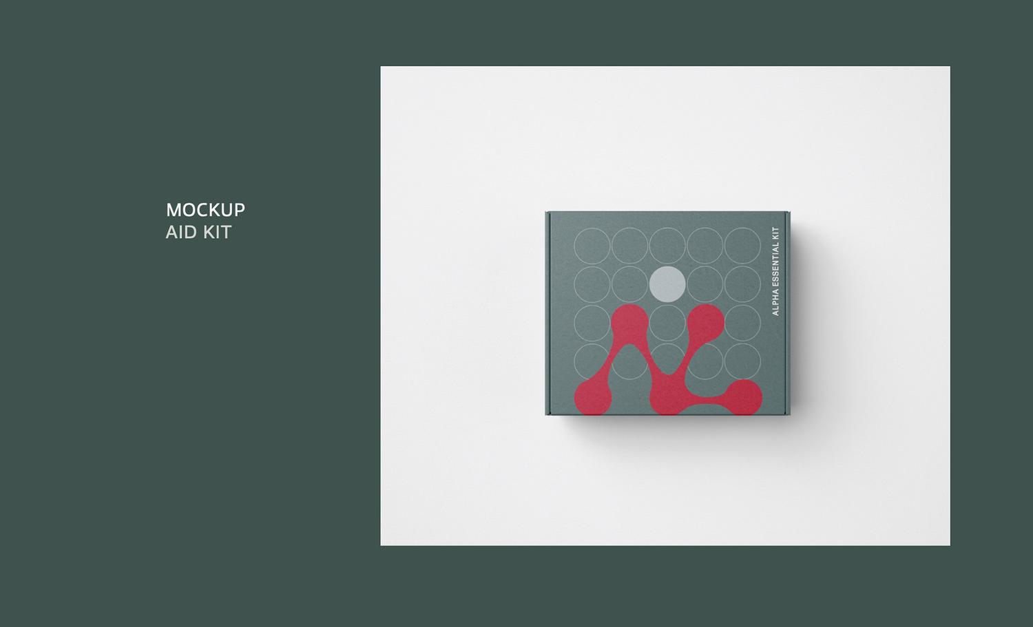
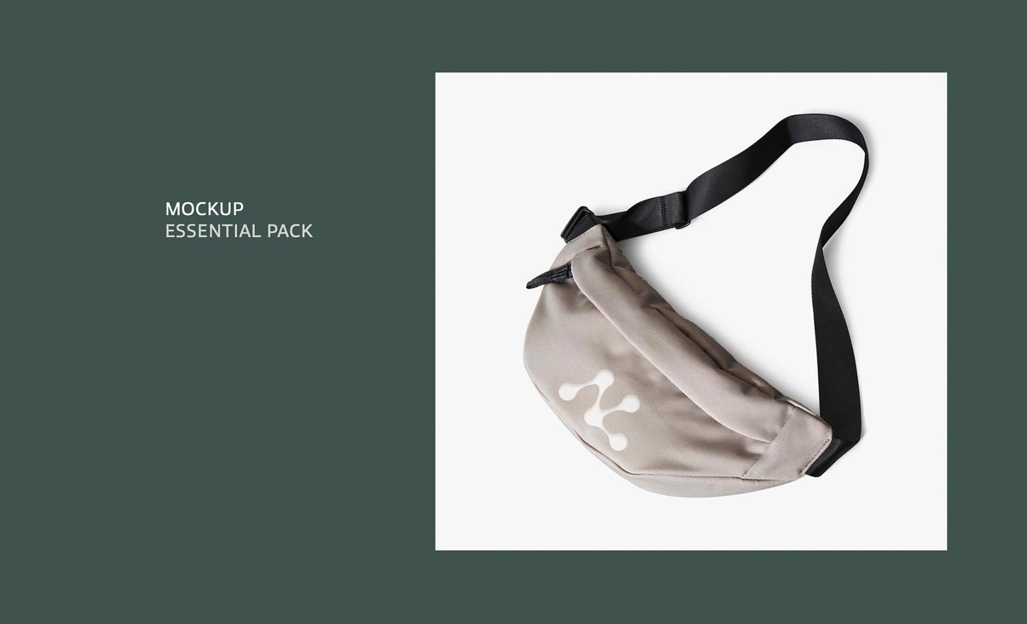
ALPHA LAB
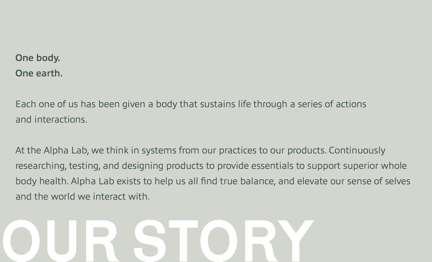
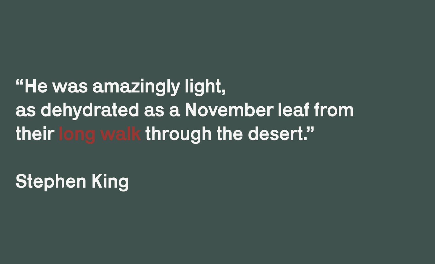
Identity for commerce based on the novel The Long Walk by Stephen King. ‘Alpha Lab’ is a commodity that focuses on continuously researching, testing, and designing products to provide essentials to support superior whole body health.
︎VISUAL IDENTITY
Identity for commerce based on the novel The Long Walk by Stephen King. ‘Alpha Lab’ is a commodity that focuses on continuously researching, testing, and designing products to provide essentials to support superior whole body health.
Visual assets include their stylescape, aid kit, and essential pack.
︎︎︎ SCROLL SLIDESHOW
AVA
︎VISUAL IDENTITY
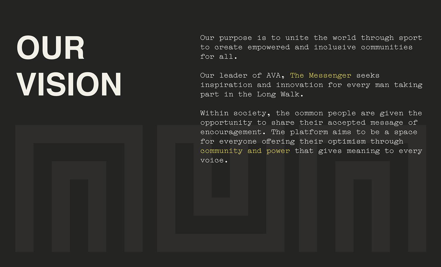
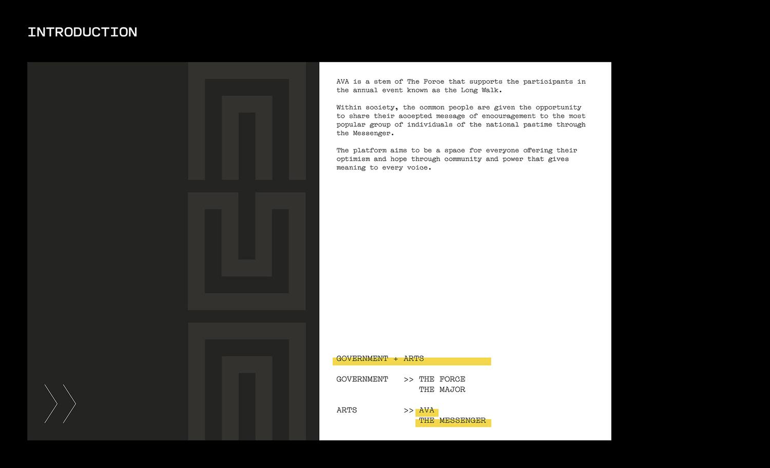
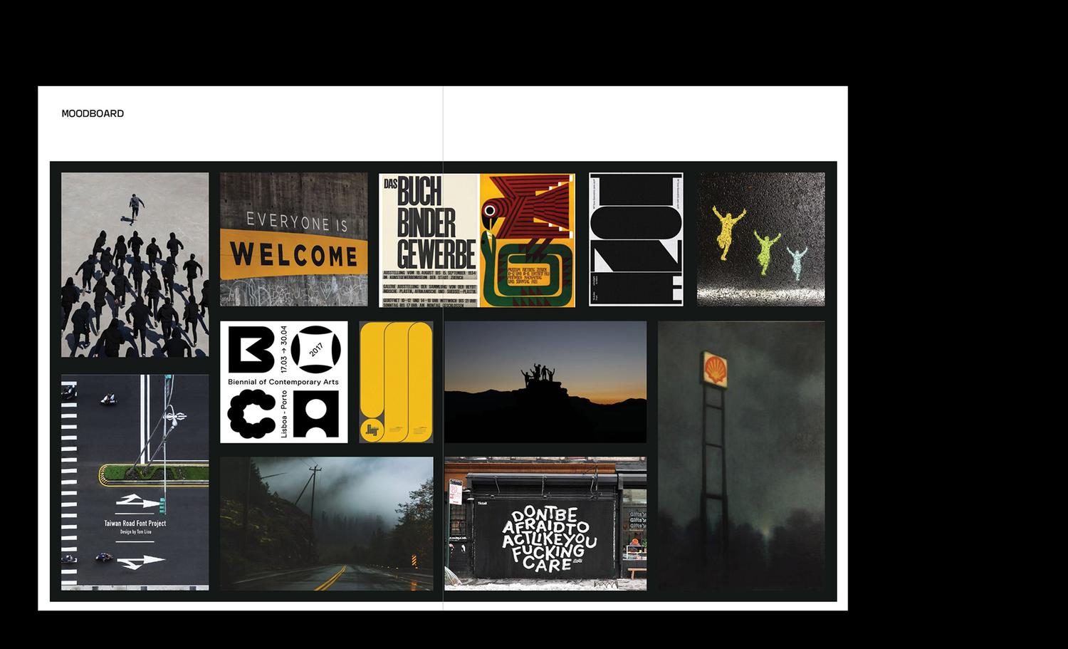
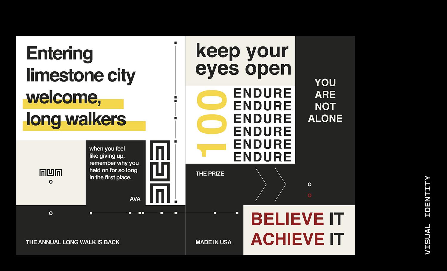
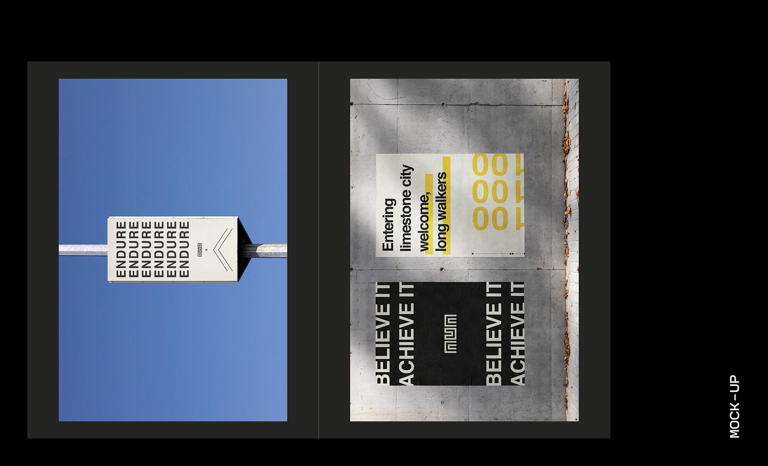
Identity for masses based on the novel The Long Walk by Stephen King. ‘AVA’ is a platform that supports the participants in the story in the annual event known as the Long Walk. Their purpose lies on creating a space for everyone to offer their optimism through messages and public design that gives meaning to every voice.
︎VISUAL IDENTITY
︎PRINT DESIGN
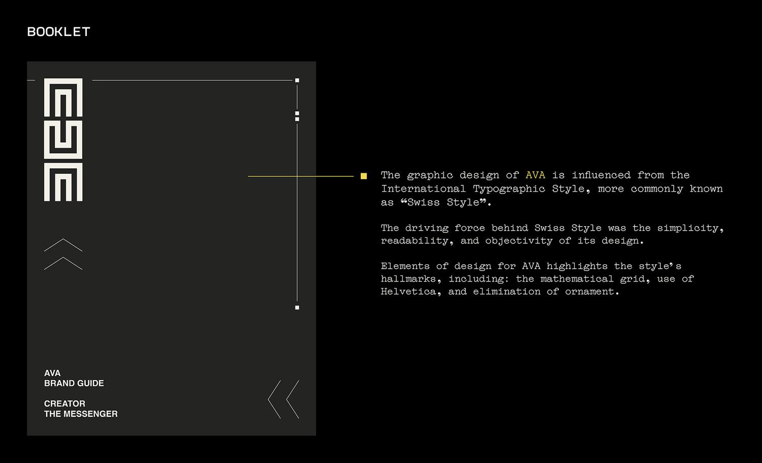
Identity for masses based on the novel The Long Walk by Stephen King. ‘AVA’ is a platform that supports the participants in the story in the annual event known as the Long Walk. Their purpose lies on creating a space for everyone to offer their optimism through messages and public design that gives meaning to every voice.
Visual assets include their booklet and signage.
︎︎︎ SCROLL SLIDESHOW
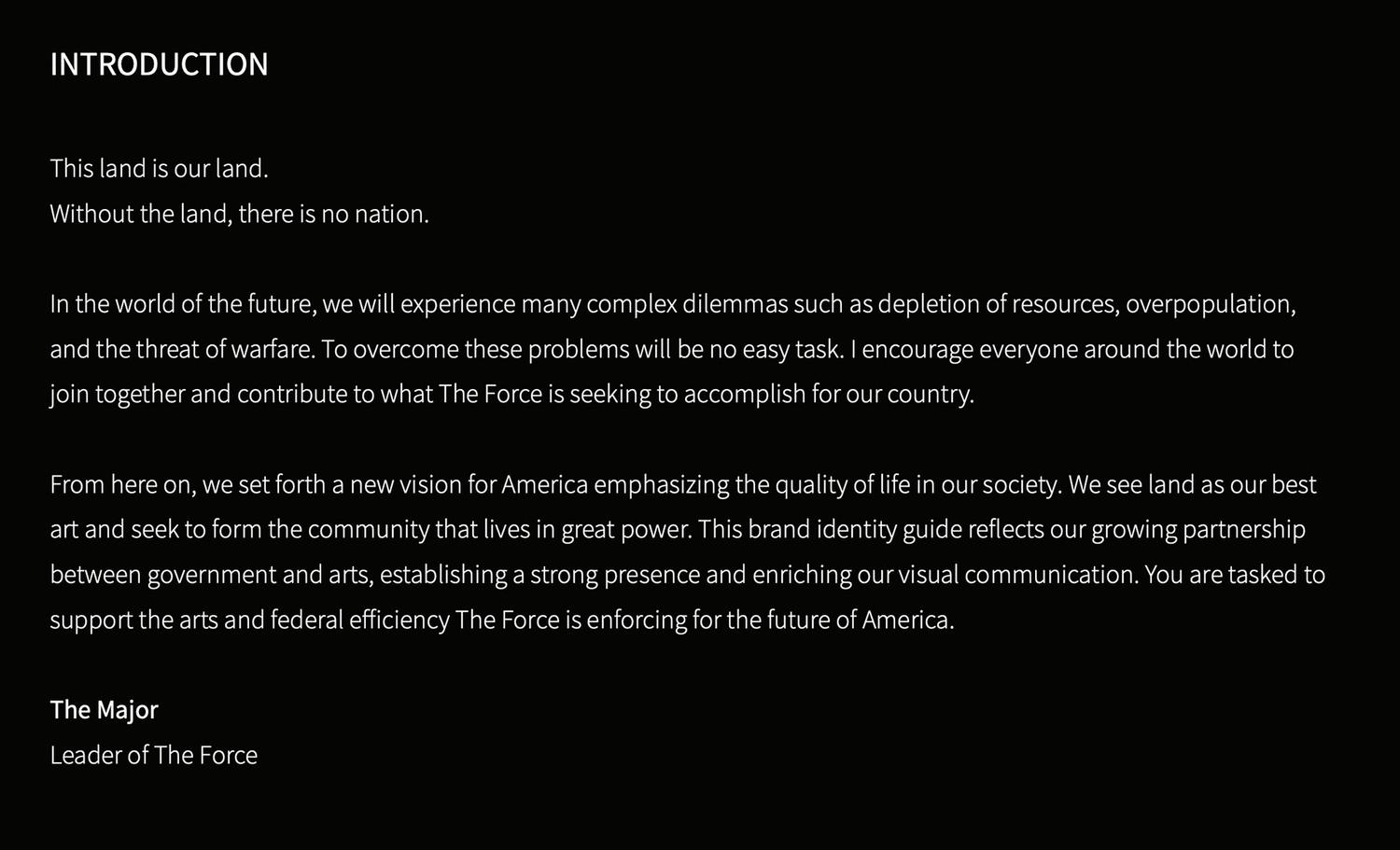
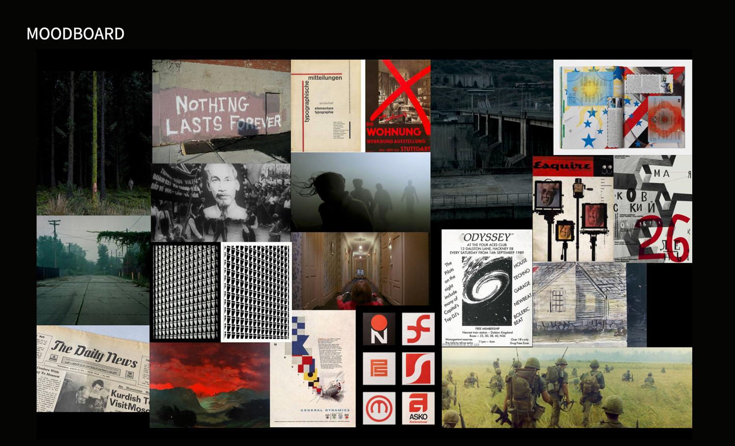
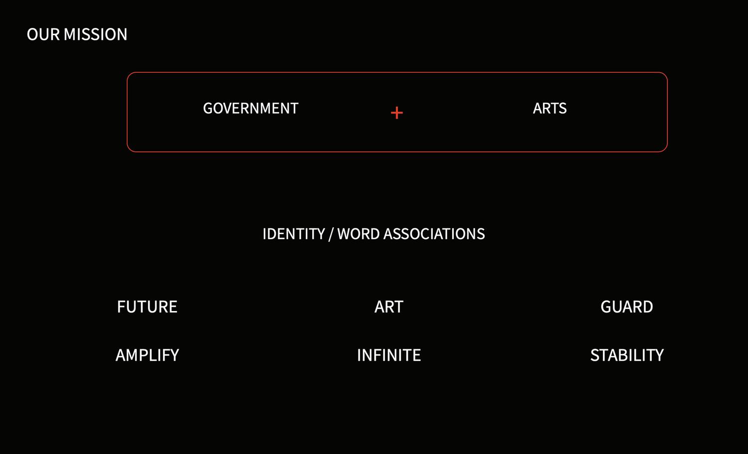
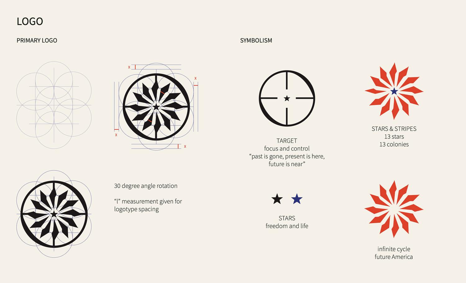
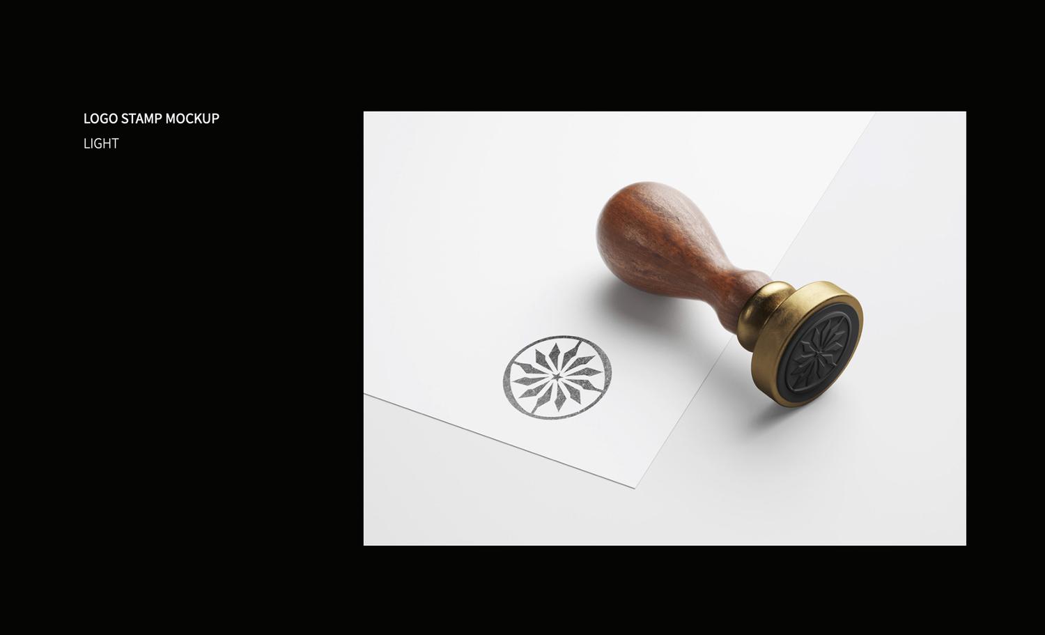
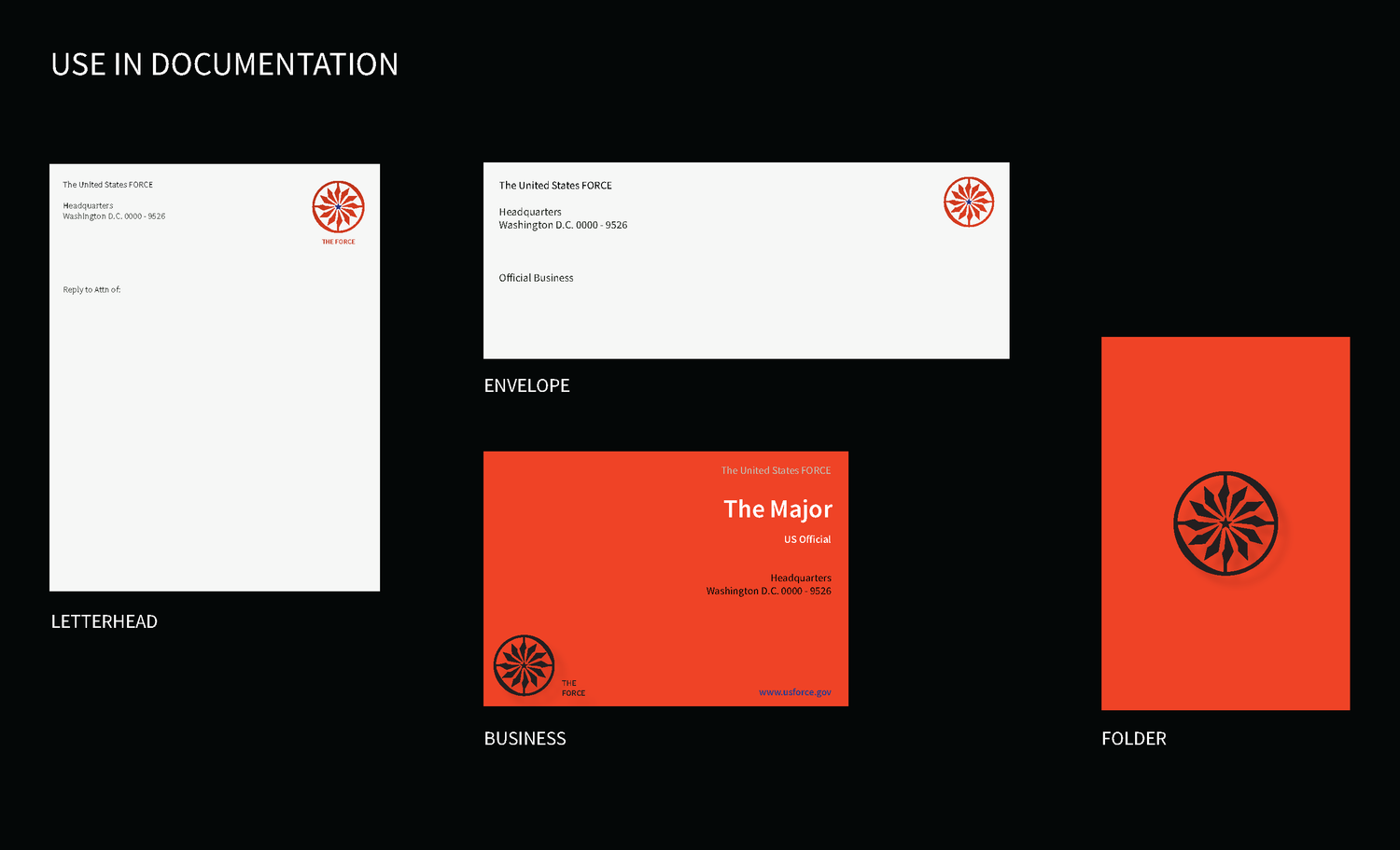
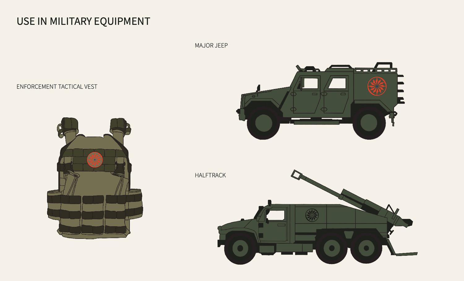
THE FORCE
Identity for governance based on the novel The Long Walk by Stephen King. ‘The Force’ is a form of government where the world experiences many complex dilemmas, such as depletion of resources, overpopulation, and the threat of warfare. Their purpose lies on setting forth a new vision for America that supports the arts and federal efficiency.
︎VISUAL IDENTITY
Identity for governance based on the novel The Long Walk by Stephen King. ‘The Force’ is a form of government where the world experiences many complex dilemmas, such as depletion of resources, overpopulation, and the threat of warfare. Their purpose lies on setting forth a new vision for America that supports the arts and federal efficiency.
Visual assets include their use in documentation and military equipment.
︎︎︎ SCROLL SLIDESHOW
GENTLE BULL TATTOO
︎VISUAL IDENTITY
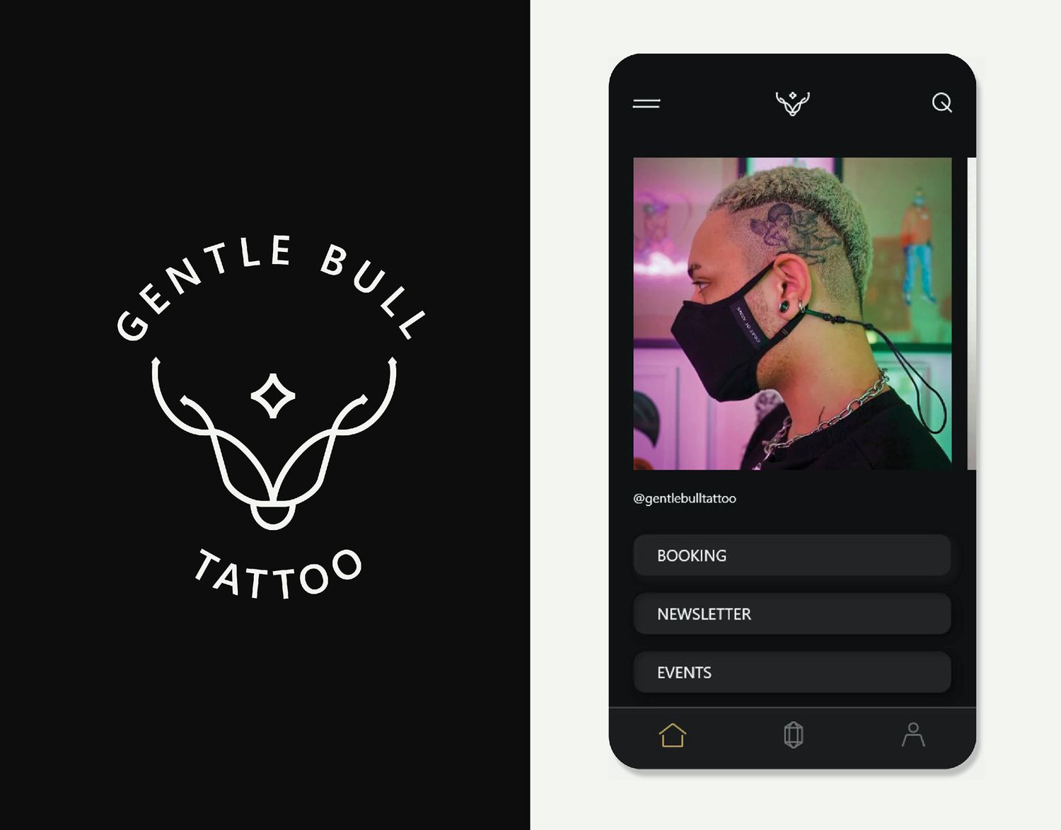
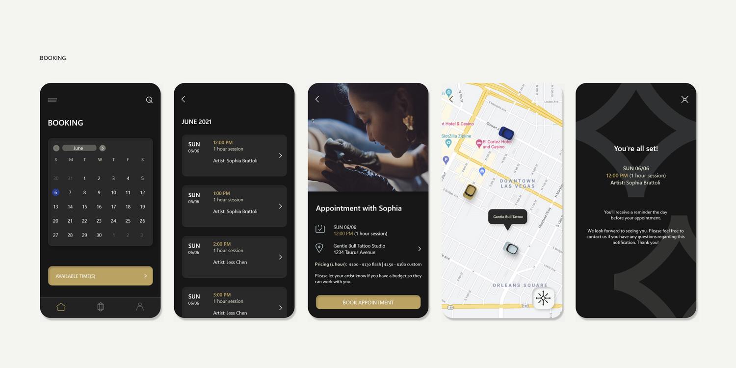
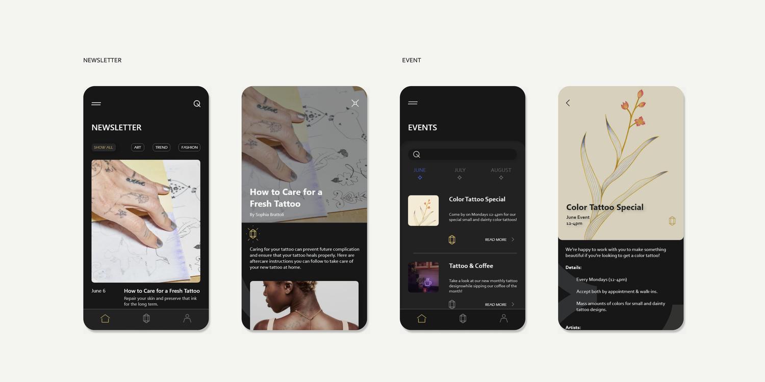
Identity and UX design guide for a potential tattoo studio and coffee shop business. Gentle Bull Tattoo takes inspiration from art and astrology to develop a shared community for all artists and clients. The goal for the UX design highlights the studio’s ambition to share talents in art and design and to create a business that offers a collaborative experience.
︎VISUAL IDENTITY
︎UX DESIGN
Identity and UX design guide for a potential tattoo studio and coffee shop business. Gentle Bull Tattoo takes inspiration from art and astrology to develop a shared community for all artists and clients. The goal for the UX design highlights the studio’s ambition to share talents in art and design and to create a business that offers a collaborative experience.
Final application features include booking tattoo appointments and reading about latest trends and upcoming events at the studio.
︎︎︎ SCROLL SLIDESHOW


JOY EARTH
︎VISUAL IDENTITY
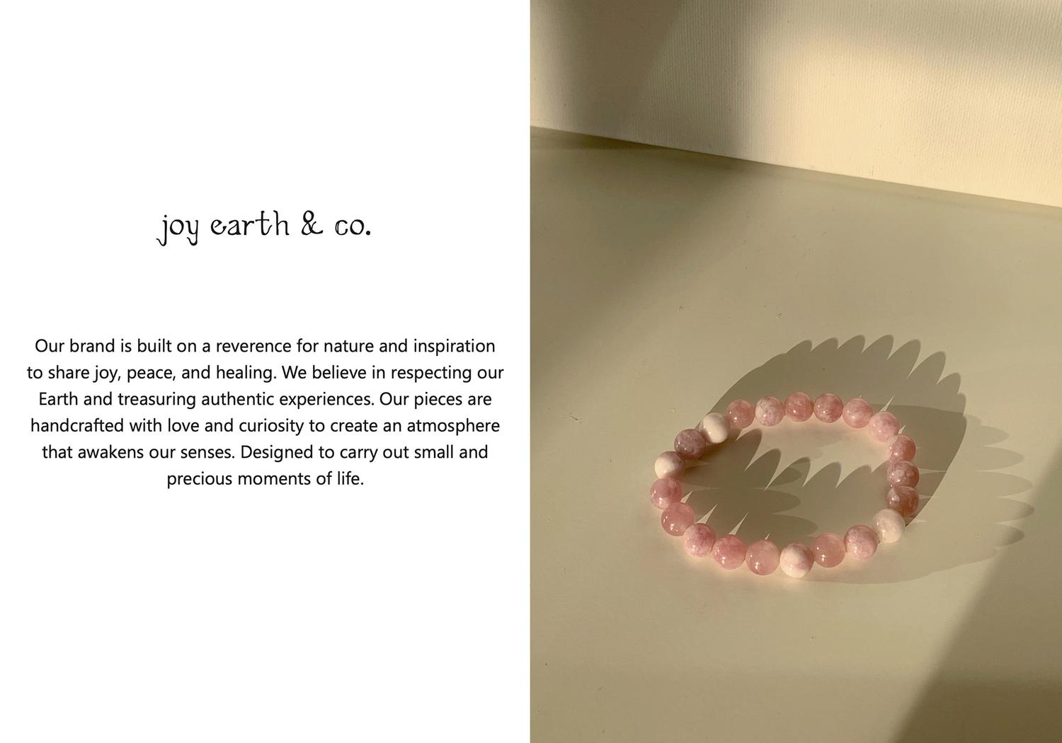
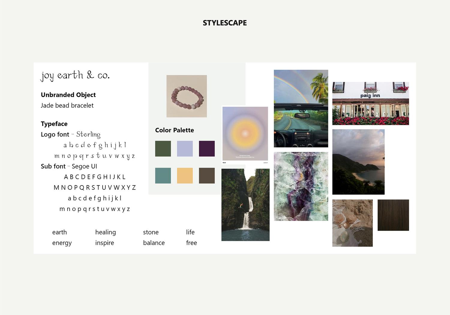
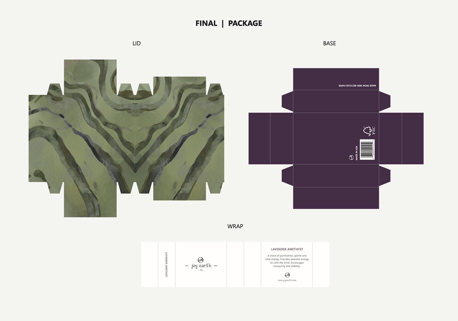
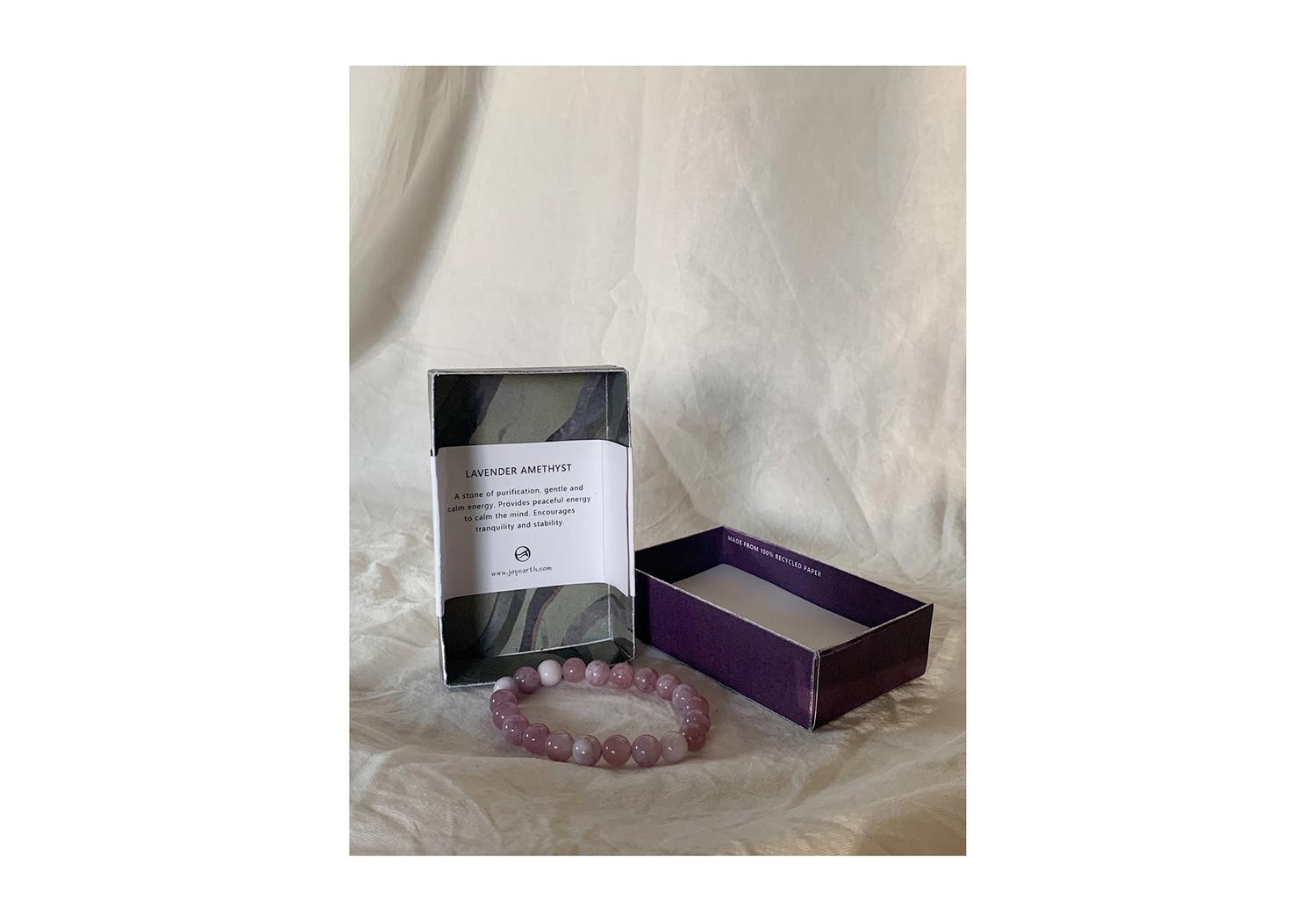
Identity for a handcraft jewelry line created to emphasize reverence for nature and inspiration to share joy, peace, and healing.
︎VISUAL IDENTITY
︎PRODUCT DESIGN
Identity for a handcraft jewelry line created to emphasize reverence for nature and inspiration to share joy, peace, and healing.
︎︎︎ SCROLL SLIDESHOW

MOON STUDIO
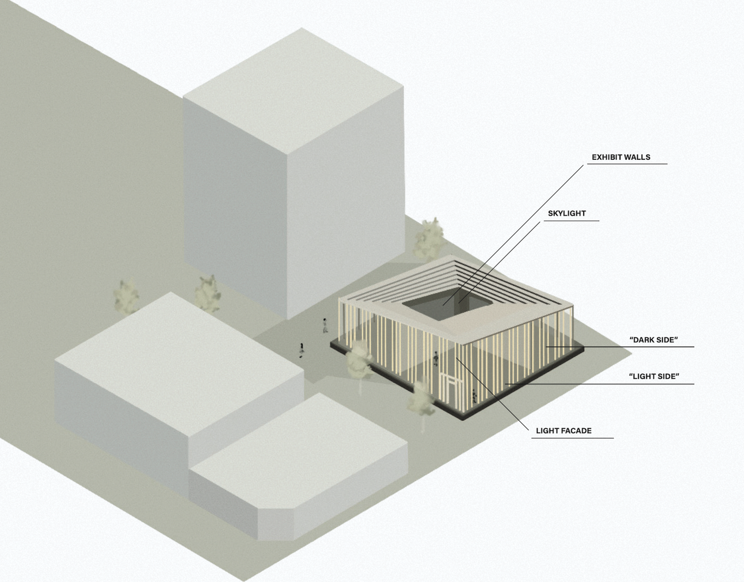
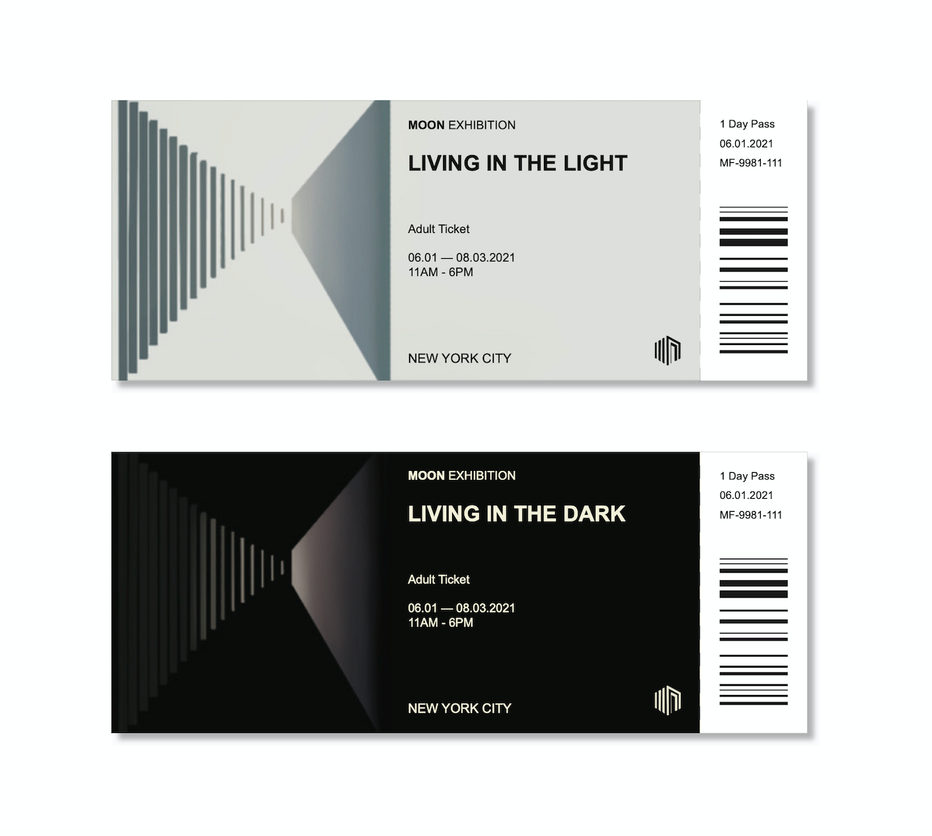
Identity for a contemporary art exhibition and gallery influenced by urban architecture and the environment. In this space, there are two ways of entry, each space with its own experience of being taken away from reality and the city.
︎VISUAL IDENTITY
Identity for a contemporary art exhibition and gallery influenced by urban architecture and the environment. In this space, there are two ways of entry, each space with its own experience of being taken away from reality and the city.
Visual assets include collateral and an isometric view of the square plan and division of the two spaces.
︎︎︎ SCROLL SLIDESHOW
KANG HEE KIM BOOKMARKS
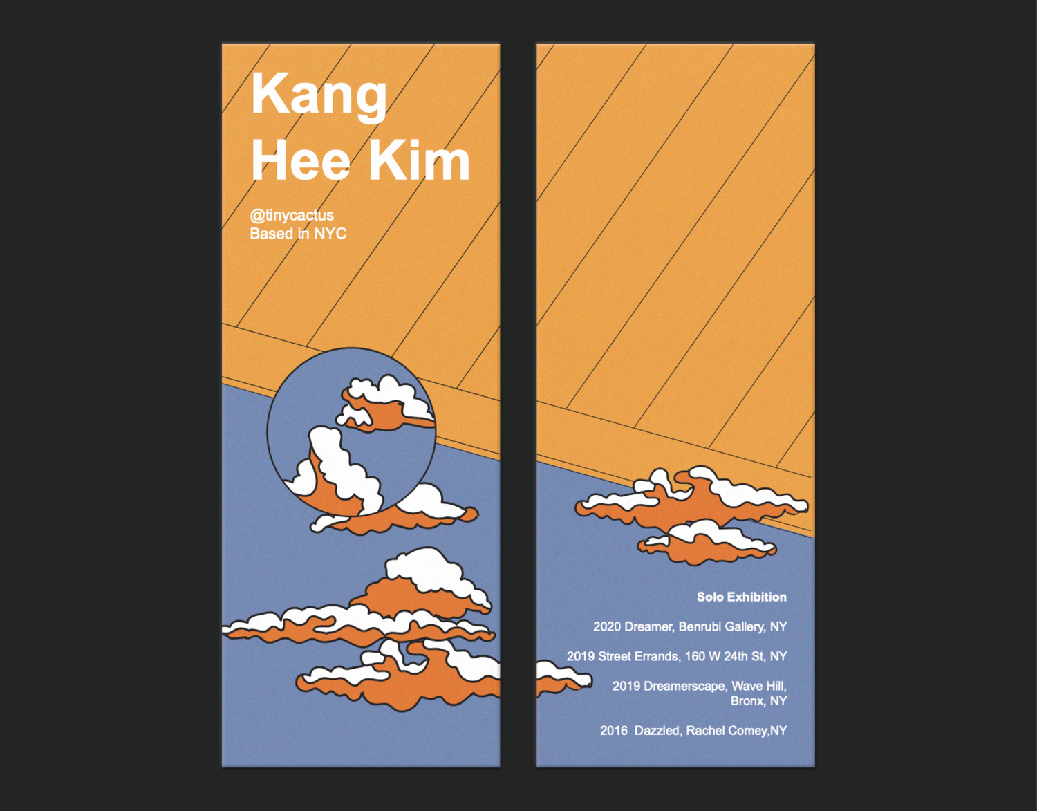
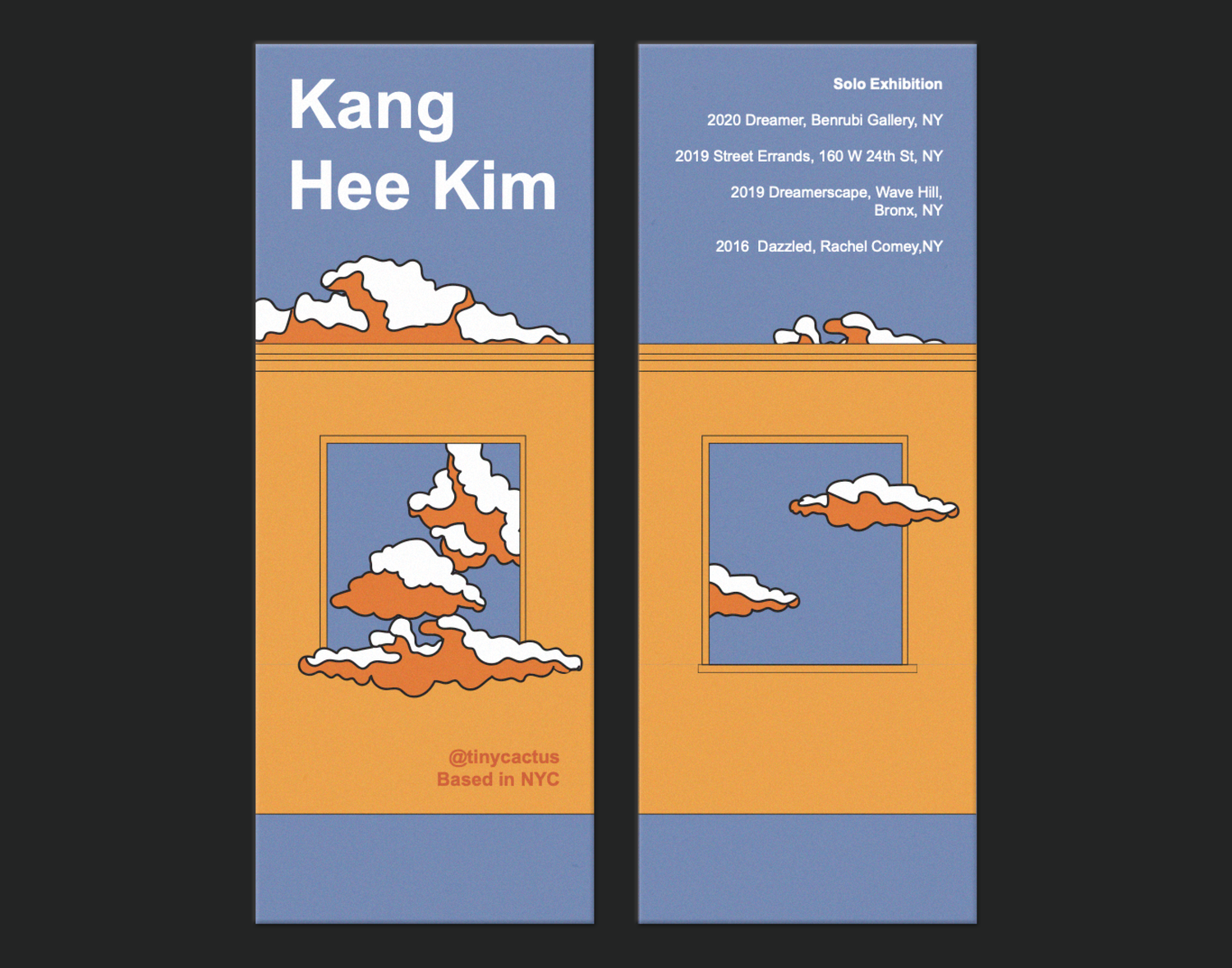
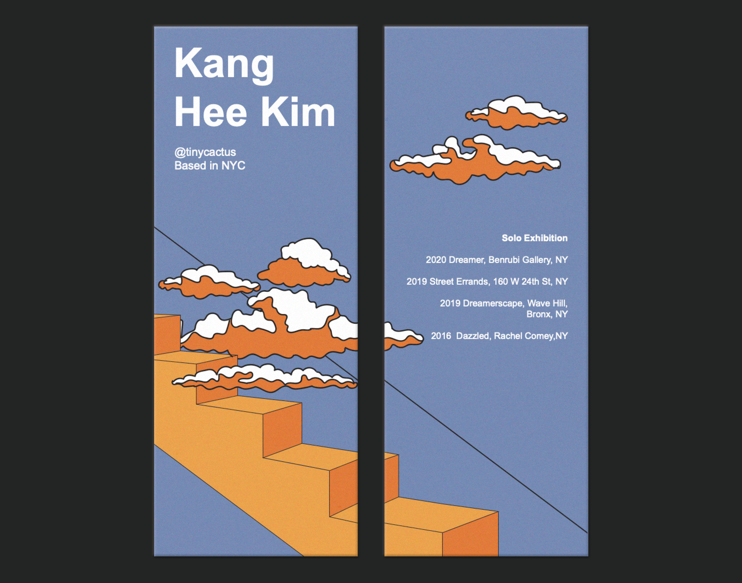
Kang Hee Kim is a New York-based artist whose work encapsulates the emotional attachment to surreal landscapes. The design of these bookmarks is inspired by Kang Hee Kim to promote her solo exhibition, illustrating her leading work in the realm of photography.
︎ILLUSTRATION
Kang Hee Kim is a New York-based artist whose work encapsulates the emotional attachment to surreal landscapes. The design of these bookmarks is inspired by Kang Hee Kim to promote her solo exhibition, illustrating her leading work in the realm of photography.
︎︎︎ SCROLL SLIDESHOW
